DESIGN SYSTEM INITIATIVE
Zume would require many new digital tools to handle all of the areas the company wanted to solve. We needed a design system that could provide consistency, scalability, and accessibility as we designed.
Zume Pizza became part of the greater company Zume in April 2018. Taking on a wide view of the food supply chain, Zume’s purpose, in short, was to create a sustainable food future as a B2B food operations company.
This meant that many new B2B tools would need to be built for Zume partners. Service monitoring dashboards, equipment/food inventory management, support ops tools, and customer-facing interfaces are a few examples of tools that Zume would be offering to their partners.
I was part of a small team that researched approaches and iterated based on anticipated needs. The result was a baseline of guidelines, design primitives, and components built in Figma that were used across projects for Zume.
MY ROLE & TEAM
Research, synthesis, testing, and iteration
TEAM
3 product designers, presenting to product managers and engineers
TIME
6 months
TOOLS
Figma, GSuite
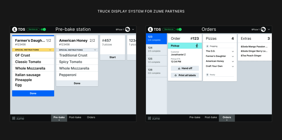
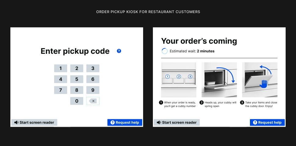
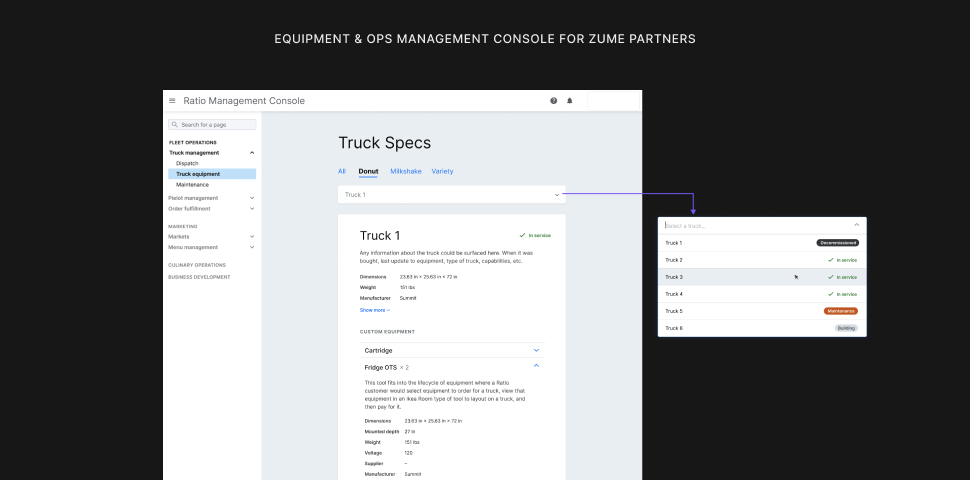
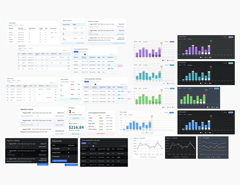
TOOLS WE MADE WITH OUR DESIGN SYSTEM
Applications of our design system to various projects, including a truck management tool, a kiosk for order pick-up, and truck display system (TDS) for expediters aboard Zume’s food trucks.
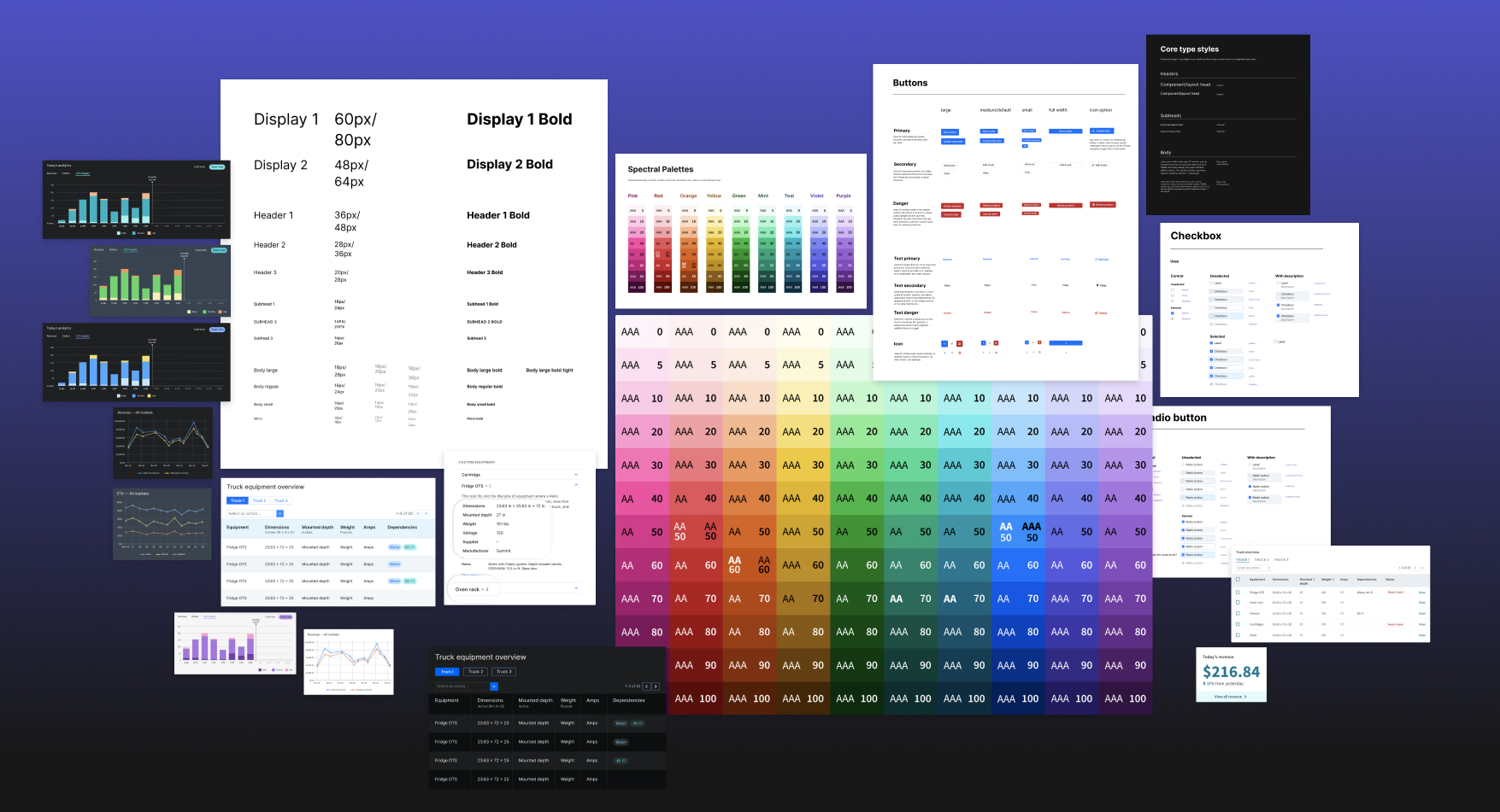
CORE PRIMITIVES FOR CONSISTENCY
To help designers make consistent decisions, sets of core primitives were chosen from our design system as go-to's for designers (click to zoom).
KICKOFF
A lot of new tools needing to be designed would be coming our way fast
Work on new tools was not prioritized yet, but we knew a design system would be necessary for Zume’s software products to grow sensibly. With only 3 product designers and over 100 engineers, we needed the ability to focus on the higher-level challenges coming our way. Our strategy was to frontload as many high-level decisions as possible by researching best practices and then balance our findings with Zume’s product needs.
Our strategy was to frontload as many high-level decisions as possible with research, and then balance our findings with Zume’s product needs.
PREVIOUS DESIGN SYSTEM SITUATIONS
We used some Sketch kits and style guides to give some level of visual consistency across the many ops tools Zume Pizza used, but we frequently found ourselves deviating from even the most basic components to deliver a better UX. Many of the documents were only useful for a single tool.
My role
My contributions included:
- Research and documentation on design systems and accessibility
- Experimenting with and testing the system
- Refinement of color palettes and type styles
- Documentation of the decisions we made and why
I worked with 2 other Product Designers on this research and exploratory work. We also ran our work by a Product Manager and engineering teams to get their feedback on our approach. We worked on this project whenever there were lulls and gaps between other Zume projects for about 6 months.
With only 3 product designers and over 100 engineers, we needed the ability to focus on the higher-level challenges coming our way.
RESEARCH
Documenting best practices, learnings, and examples
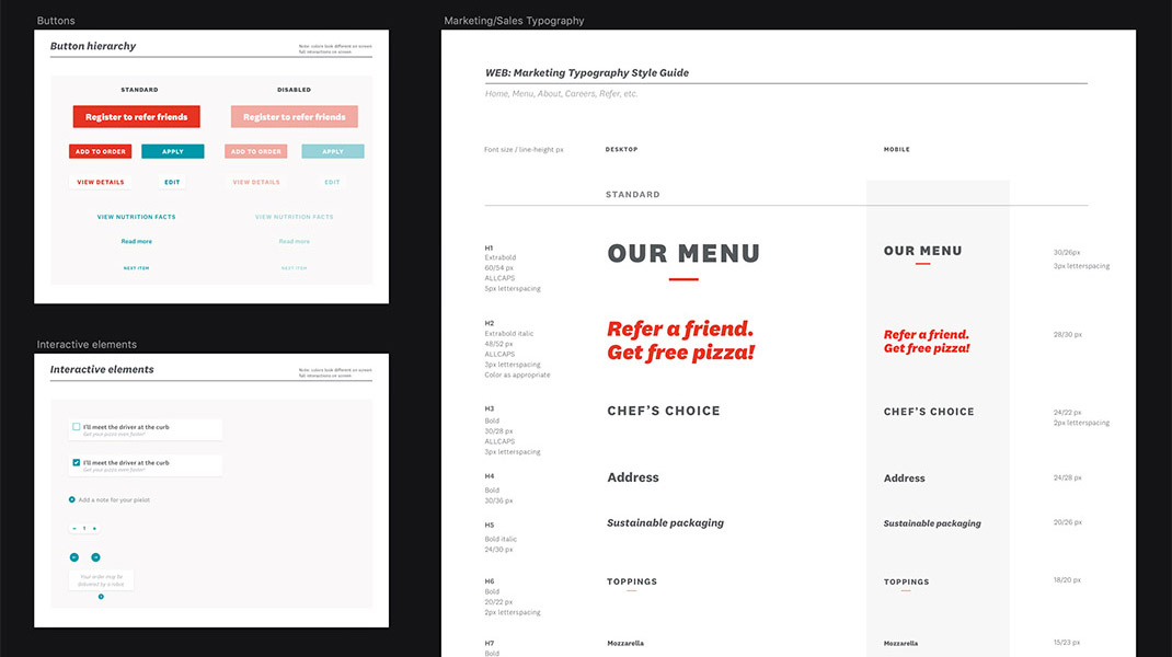
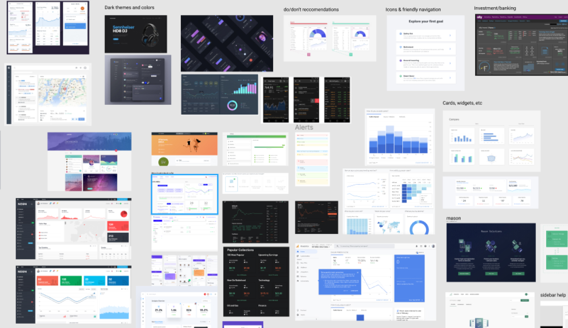
We took time to learn as much as possible about design systems and accessibility in visual systems as we could throughout our work, especially investigating other B2B platforms. We also collected visual examples of different systems and UI elements to reference and discuss all in one place.
The three of us made sure to share resources and learnings with each other through articles, design system examples, and documentation that we created. This gave us a solid baseline of knowledge to work with as we moved forward.
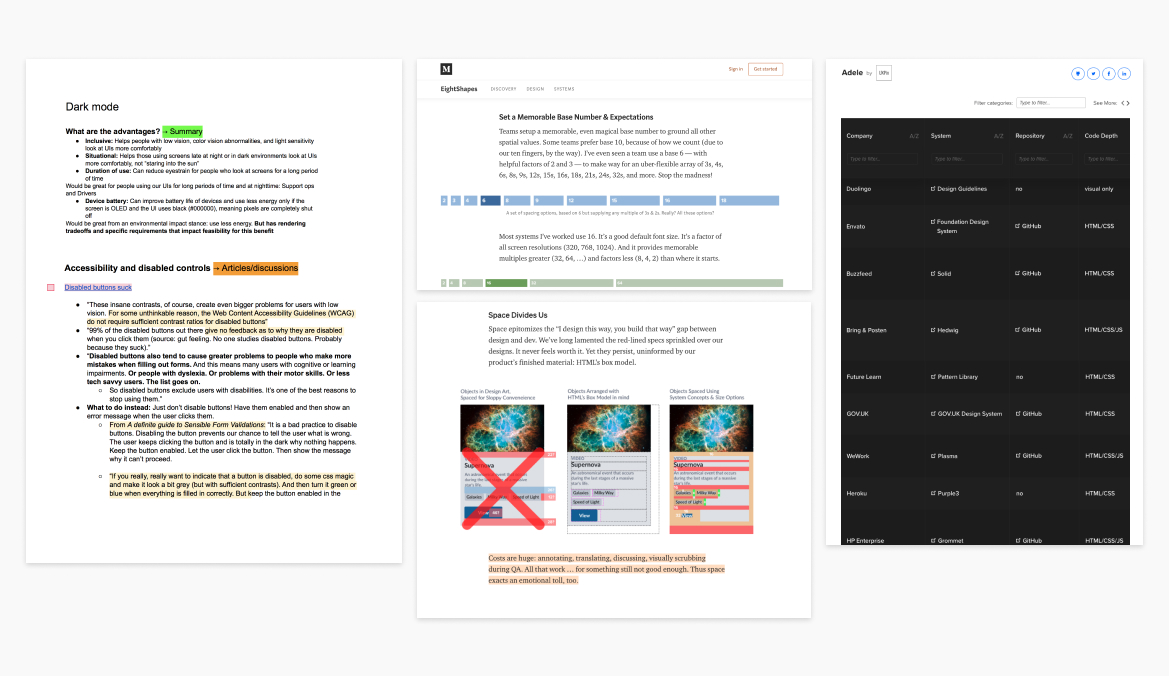
RESEARCH DOCUMENTATION
Design systems resources we referenced (Adele, articles by EightShapes) and examples of research documentation I put together including summaries of sources on specific areas either I or my team flagged as areas of interest. We also created a Figma document of different UI examples for reference.
TESTING & ITERATION
Testing strengths and weaknesses of the first iteration
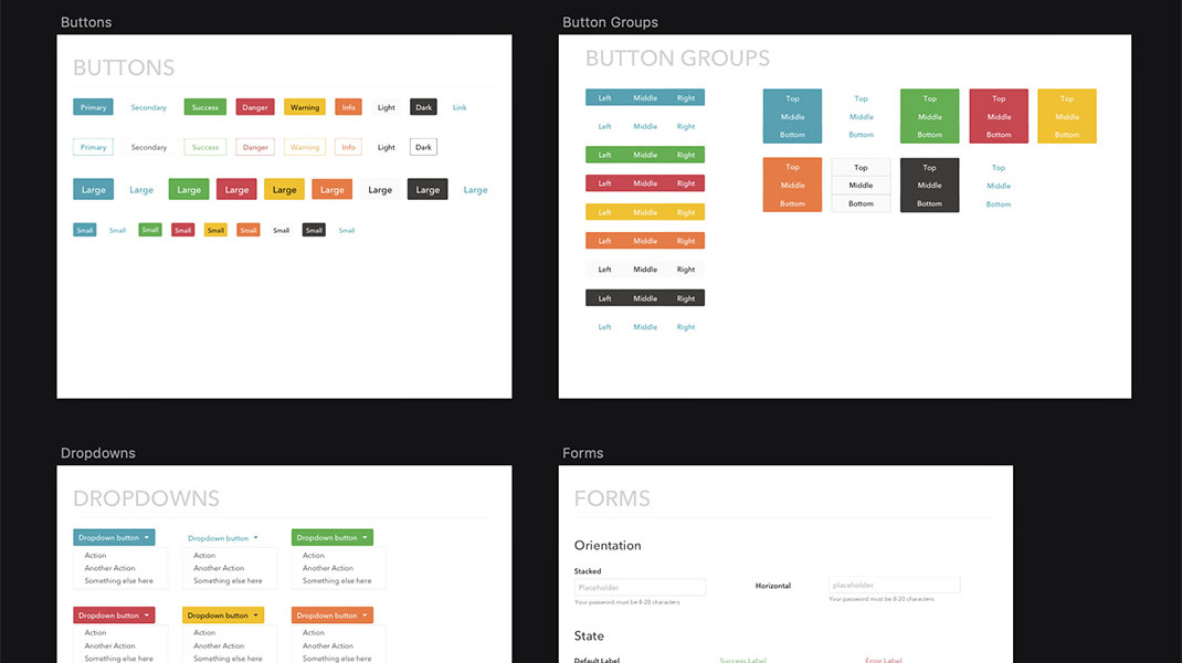
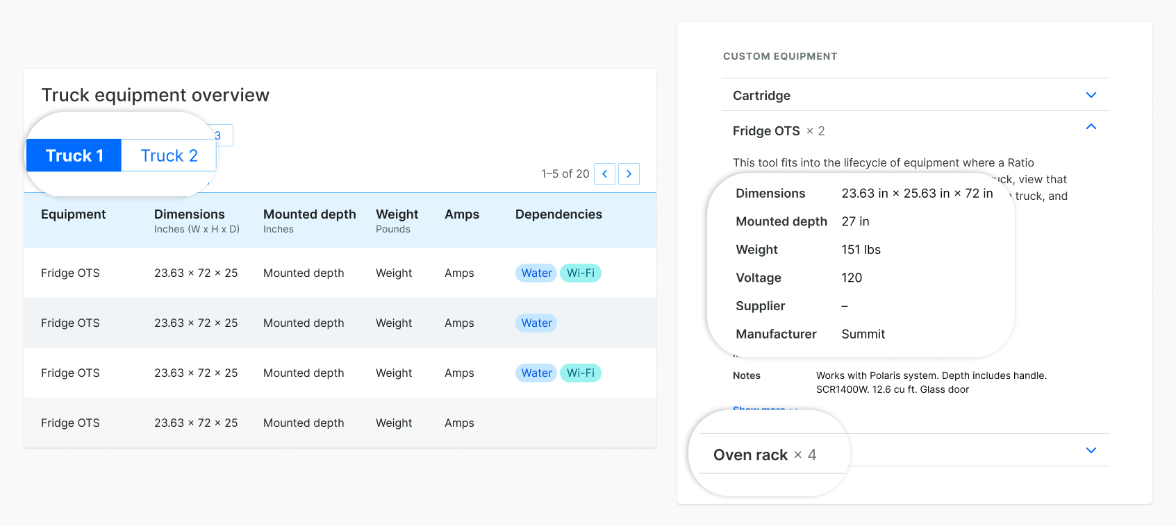
My teammate had started putting together primitives based on our knowledge, and I tested them. I started exploring variations in an admin-style interface that I designed based on existing Zume Pizza views and ideas of future tools that we knew would need to take form. I annotated the frames as questions came up.
I did this by sketching out a broad range of options. Some questions I used to guide myself in this process:
- What elements/decisions distract from the information we’re presenting?
- How might multiple themes work within the same system?
Is it obvious which elements are interactive?
- What flexibility does the typography lend to the system? Do the headlines and body styles still feel like they’re effective in different information settings?
WORKING DOCUMENTATION
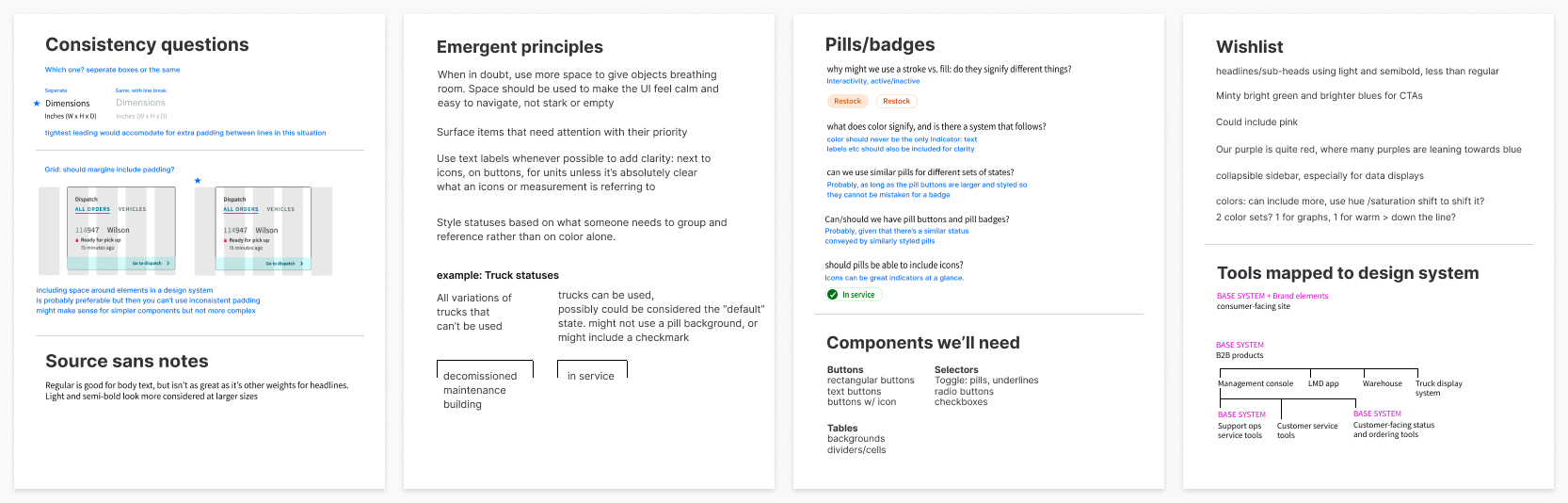
I wrote up emergent principles and questions as I went to show my team for discussion, along with items I wished I had as I designed.
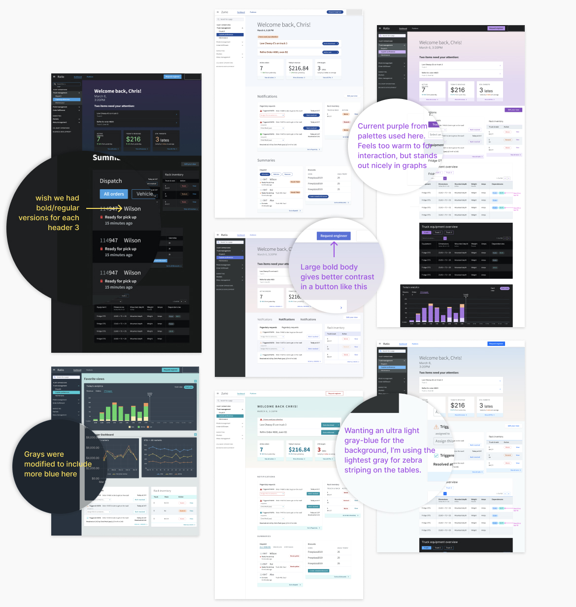
SKETCHING & ANNOTATION
Some of the iterations I worked through as I tested the system. I added notes throughout so my teammates could see examples of where I thought we could make edits.
Approaching color
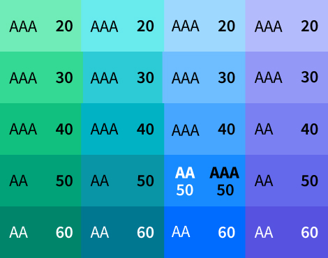
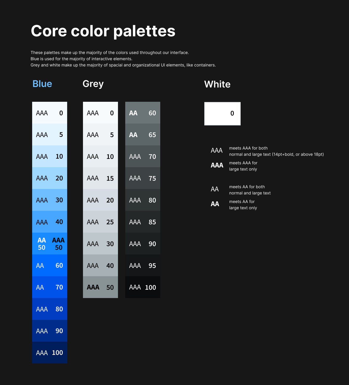
Color was one of the biggest parts of the system that we could try to get right at this early stage, so it got a lot of our focus. We were using Lyft’s Colorbox tool to generate palettes, and then tweaking by eye as necessary.
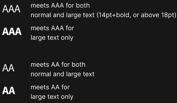
My teammate found this article by designers at Lyft which had some excellent approaches to color systems. A specific point that was valuable: make colors below 60 accessible with black text, and above 60 accessible with white text (we decided to make yellow an exception since its high luminosity is useful). By following this rule, we could make accessible contrast standards a highly visible part of our color system and give meaning to the way we named our colors.
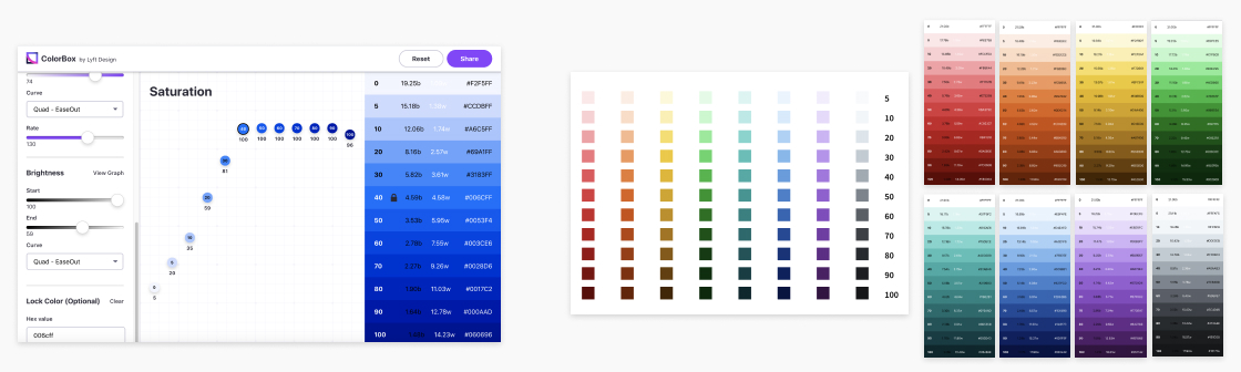
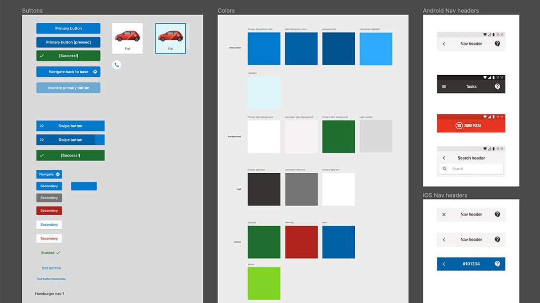
EARLY PALETTES
Colorbox, and some of the early color palettes my teammate had worked though using Lyft’s Colorbox tool.
Iterating on palettes
Contexts of color we were considering included warnings, notifications, status changes, and data visualization. I went back and forth between plugging in colors to the sketches and tweaking the colors to find our palettes. We knew that many of Zume’s tools would need tables and data visualization. Since tables are one of the most complex components in a design system, it made sense to do testing with them.
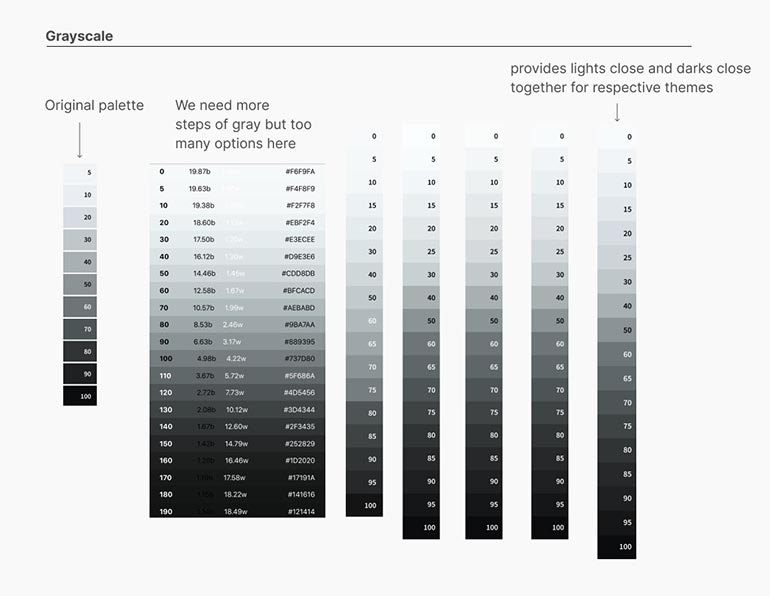
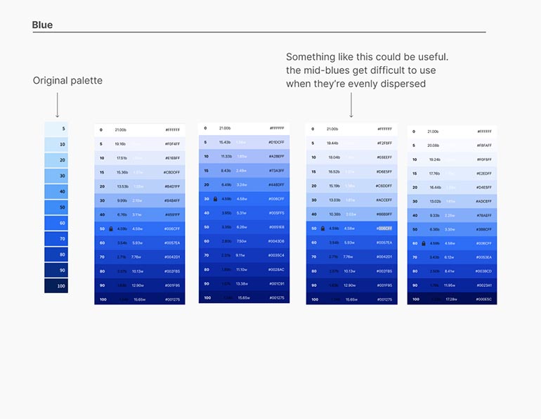
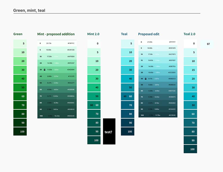
SHAPING PALETTES TO OUR NEEDS
Some iterations I worked through applied to tables and graphs, and the progression of our blue and grayscale palettes. These were especially crucial as blue became our interaction color, and grayscale would be defining the majority of containers and backgrounds.
Refining type
Our process for refining type was very similar to the way we approached color: research best practices, test them out for ourselves, and make edits that work better for Zume’s product needs.
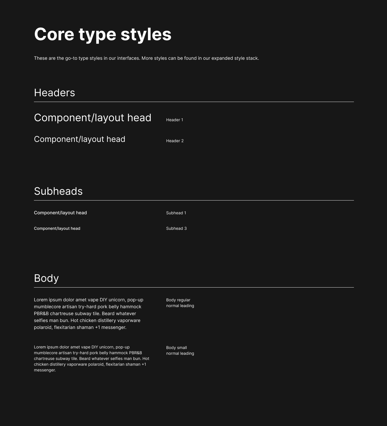
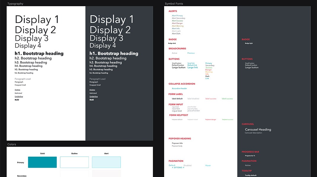
I made suggestions based on how the existing type system was working for the types of elements I was creating. I included a variety of type treatments to see where the system started to break down. An example of how this affected the final system: since different weights of the same header proved useful in testing, we ended up having 2 sets of headers in our type hierarchy: regular and bold.
REGULAR AND BOLD PAIRINGS
These examples show how bold styles were used often enough in the types of views we'd be designing that it made sense to standardize a bold style for each of our headers.
SYSTEM DETAILS
Deciding on specifics
Working through this project, we learned how we wanted Zume’s design system to work for us. By the time we needed to solidify our choices, it was easy to decide what we needed and why because of our preparation. This ultimately influenced certain decisions about our primitives that prioritized how color and type would be used to design Zume products.
Working through this project, we learned a lot about how we wanted Zume's design system to work for us. By the time we needed to solidify our choices, it was easy to determine what we needed and why because of our research and preparation. This ultimately influenced decisions about our primitives that prioritized how color and type would be used to design Zume products.
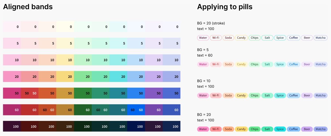
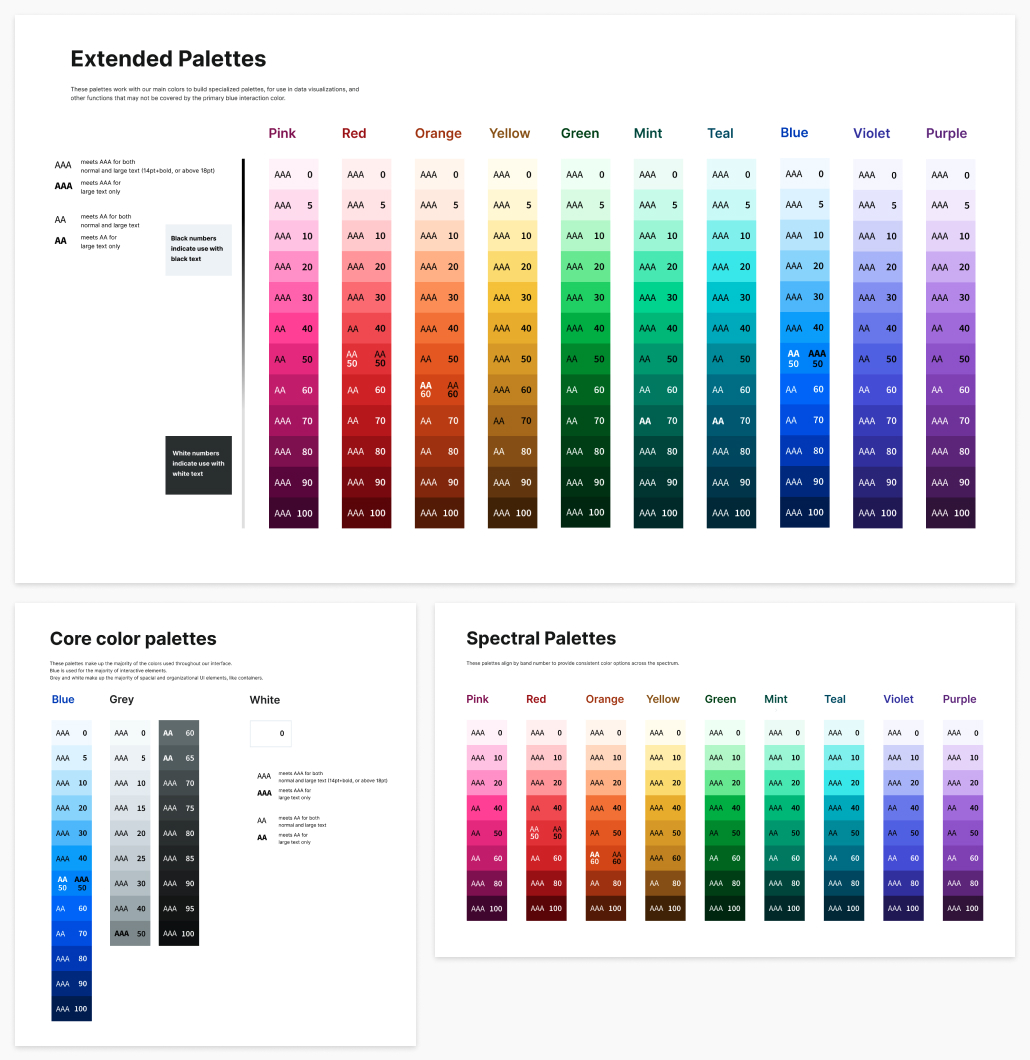
Certain horizontal bands were aligned in their saturation and vibrancy
- Allows for use in elements that should be equally weighted and balanced (pills, badges)
- Acts as an easy reference point for designers to establish balance across elements that require multiple colors
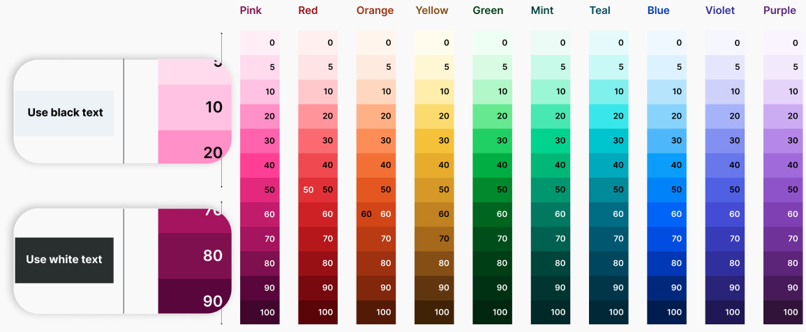
Colors labeled 50 and under are accessible with black text, while 60 and up are accessible with white (except yellow)
- Gives at minimum AA accessibility with labels pointing out which standards each color meets
- Gives designers and engineers context by the naming convention
The only exception is yellow, which logistically didn't make sense to use in darker shades
Blue was our primary interaction color choice
- Works well on both light and dark backgrounds
- Keeps its vibrance against the rest of the page
- Fits well within contrast accessibility standards
- Focuses on information rather than bringing attention to a color choice
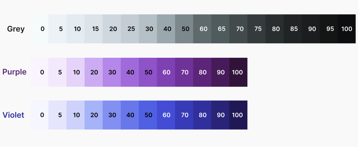
Our grayscale palette included more steps than the rest of the spectrum
Allows more background options for both light and dark UIs, accounting for layered containers and multiple states (hover, selected)
- Provides a range of highly accessible grays for text
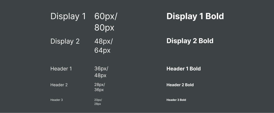
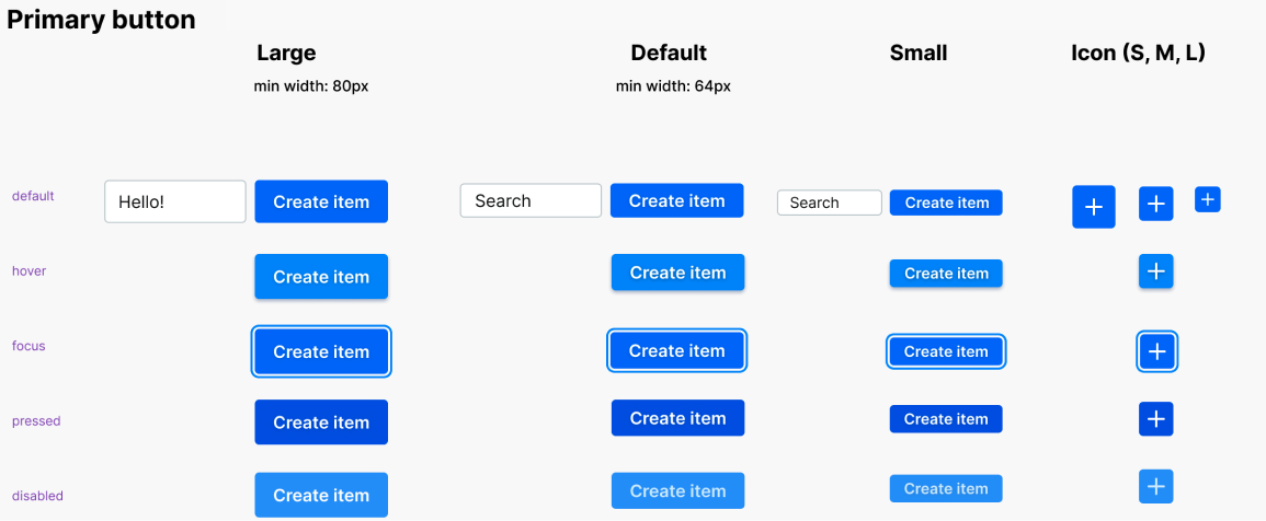
Each header type includes both regular and bold styles
- Gives better control over emphasis especially in buttons and links
- Provides consistency in the knowledge that every type style has a bold counterpart
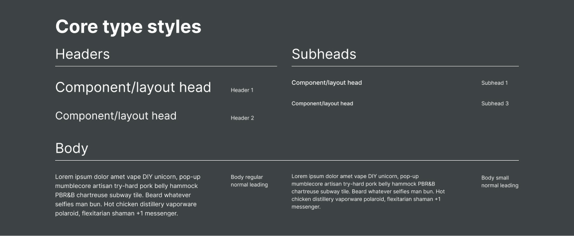
A subset of styles were chosen as go-to’s out of the library
- Equips designers with a straightforward set of choices
- Solves the most common typographic situations designers will encounter
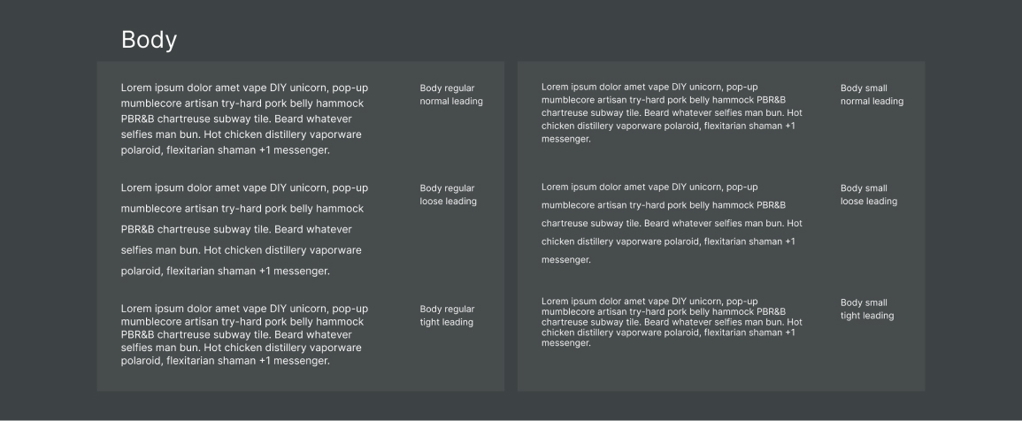
3 body styles were created with different levels of leading
- Prepares for situations where screen real estate is scarce (e.g. kitchen workflow tools on iPads)
- Provides leading presets for better consistency and adherence to the design system
FINAL DESIGN SYSTEM
Condensing exploration into a structured file
All of the learning and iteration we had done needed to be condensed into a structured file that would be useful to our team and engineers. Our file was broken down into two main groups, like most design systems: primitives and components.
Primitives
Our primitives frames documented all of the base-level colors and type options in our design system, which then made up our components. My teammate named all of the base-level styles in Figma (click to zoom).
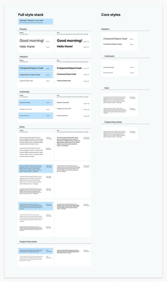
Components
My teammate worked on building our responsive components, which each included descriptive documentation advising how to use each component. Since all primitives were nested, it would be easy to make global changes quickly.
CONCLUSION
Outcomes
- One scalable Figma library for our projects with global primitives and components, made for Zume
- Documentation on decision-making and usage in long-form writing and in context throughout the Figma file
- New Zume software products designed and implemented faster with our scalable design system
What I learned
Even while building on the work of others, creating a design system is a huge undertaking. We spent a lot of time researching others’ approaches but we still ended up with a large collection of questions and gray areas that we had to solve because just like any company, Zume had specific design needs to consider. It gave me a new appreciation for systems like Carbon, Material Design, and Polaris.
Documentation makes a big difference. Our final file included short snippets of how and why to use certain elements that we didn’t have in the UI kits we had been using previously, which resulted in inconsistent use. Our documentation served as a continual reminder of the choices we had made and why.
What I would add
Solve for multiple product libraries in Figma. Zume’s planned product offering was going to be very diverse, and we needed some separation between different lines like the Management Console and Last-mile delivery tools. Both lines could benefit from parts of the design system, but there were significant differences in their use cases that affected how we needed to design (e.g. sitting at a computer in an office versus a kitchen environment). I would have liked to find a way to unite these systems enough so we could update primitives where needed since they originated from the same source, but still maintain their distinct differences.