E-COMMERCE FEATURES
Improvements to Zume Pizza’s customer-facing platforms
Designing for new devices and future customers
Designing for new devices and future customers
Designing for new devices and future customers
Designing for new devices and future customers
The following is a collection of features I worked on for Zume Pizza's consumer site and apps partnered with product managers and engineers. These were completed after an initial rebranding that refined the existing digital stores, but they were still light on helpful features for customers and the business.
Dish score design
Dish score design
Dish score design
Designing a feature for customer feedback
Zume Pizza wasn’t getting the feedback on orders that the business needed. Since one of the company’s goal was to improve how the pizza tasted, it was important for customers to consistently provide feedback on their orders while they still remembered the details.
Understanding when and how to ask customers for their thoughts
I mapped out the different situations our customers could be in after getting their order to propose the best time to ask for feedback. For the form itself, I tested different ways of presenting the questions to see which was received best and why.
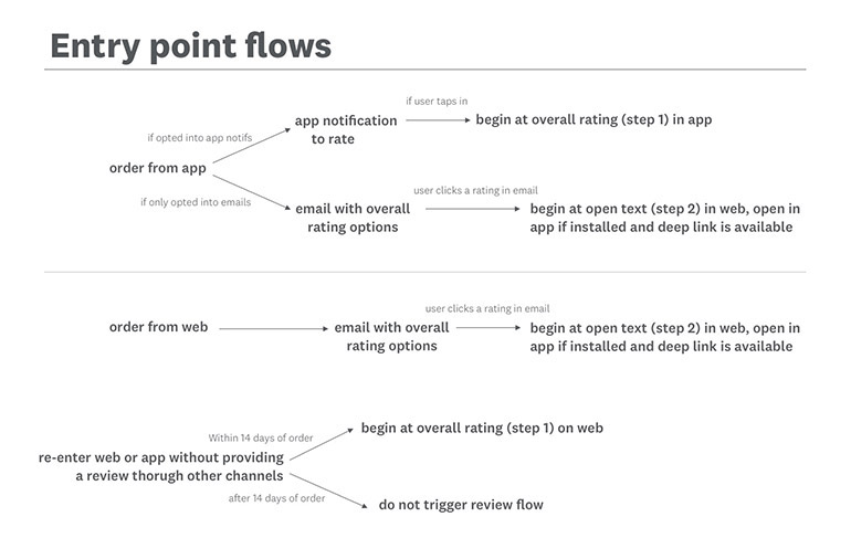
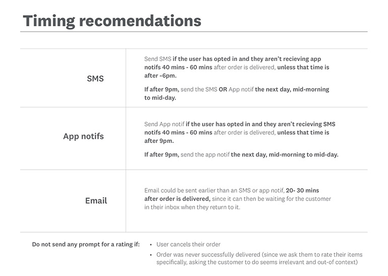
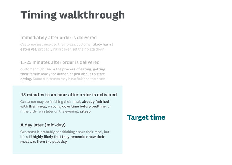
Diagrams showing how customers would encounter the ask for feedback and where asking for feedback should fit in the ordering experience.
Testing and presenting designs
I presented my research and testing findings to my team, including a product manager, engineers, and head of support operations for Zume Pizza. We weighed the needs of a baseline feedback feature against my testing results to come to a final resolution of what the first iteration would look like.
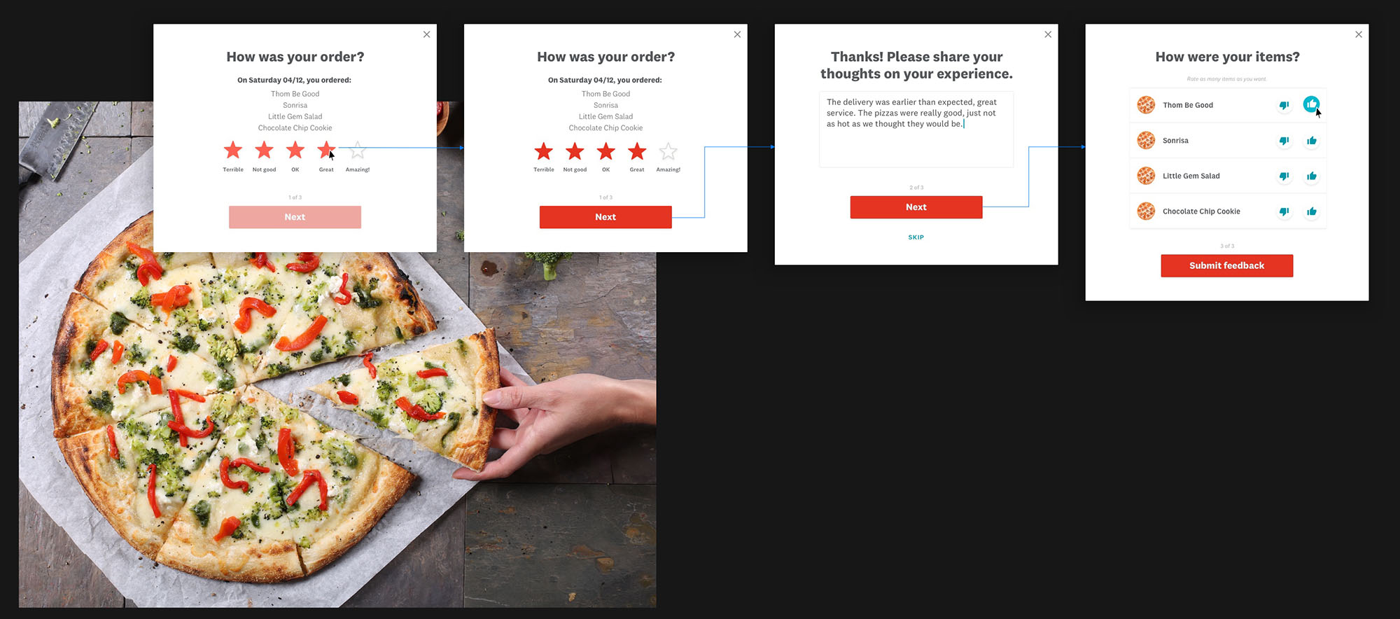
The final dish score feature gave customers a way to provide feedback directly and increased the amount of order data Zume Pizza could use to improve their recipes.
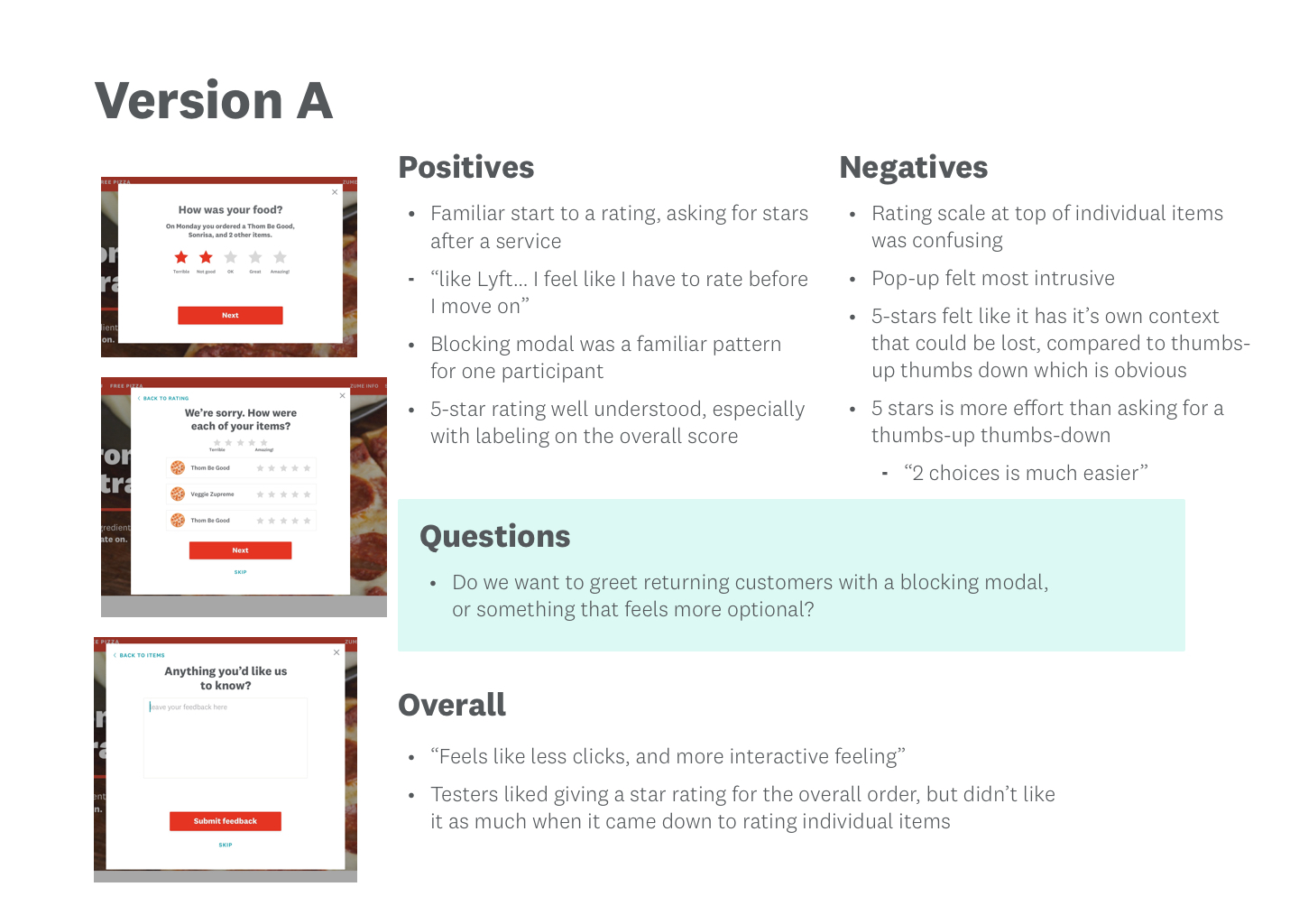
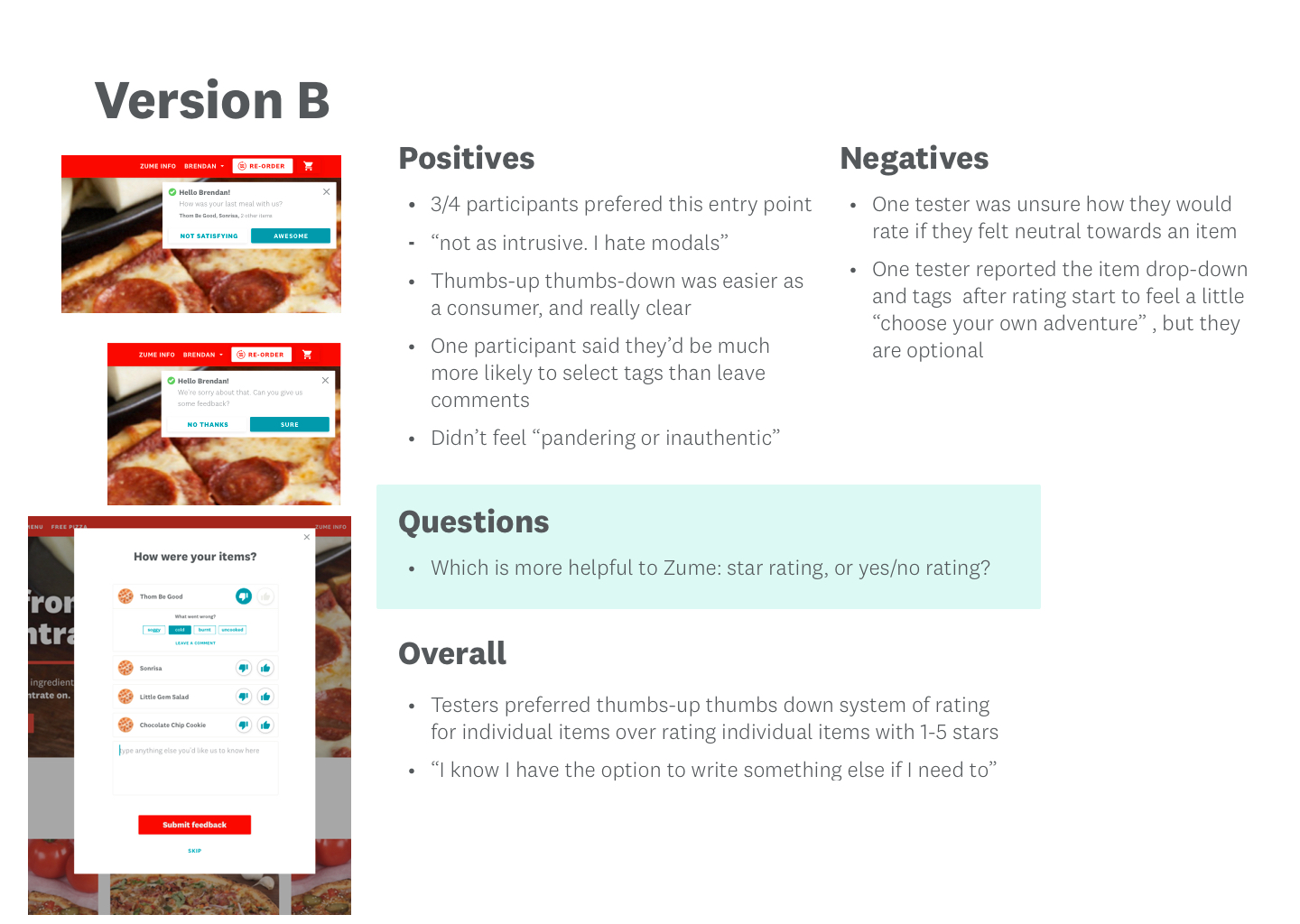
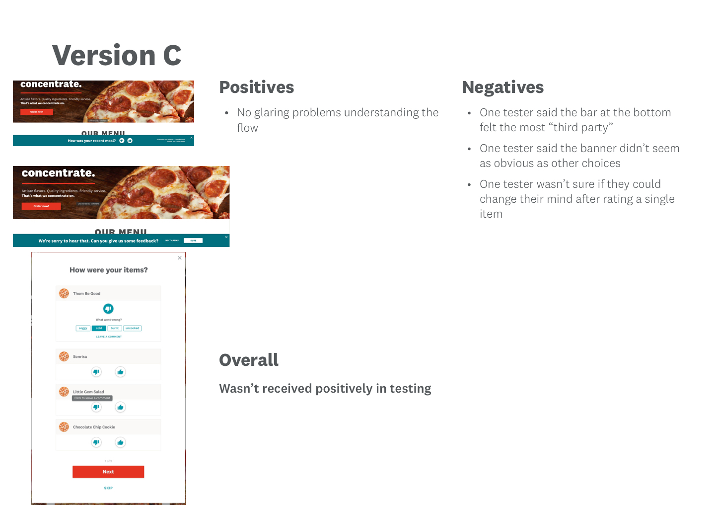
Summaries of the different versions I tested, and the feedback I got from testers.
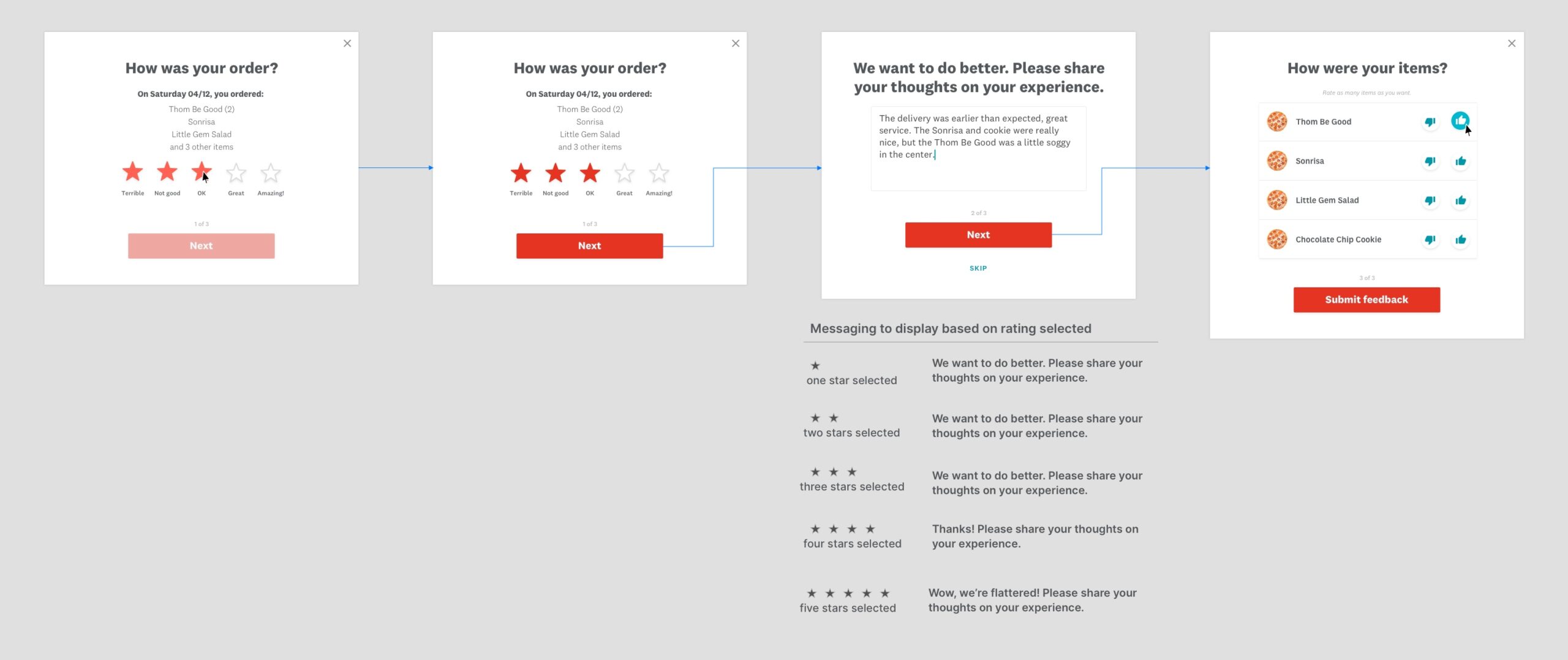
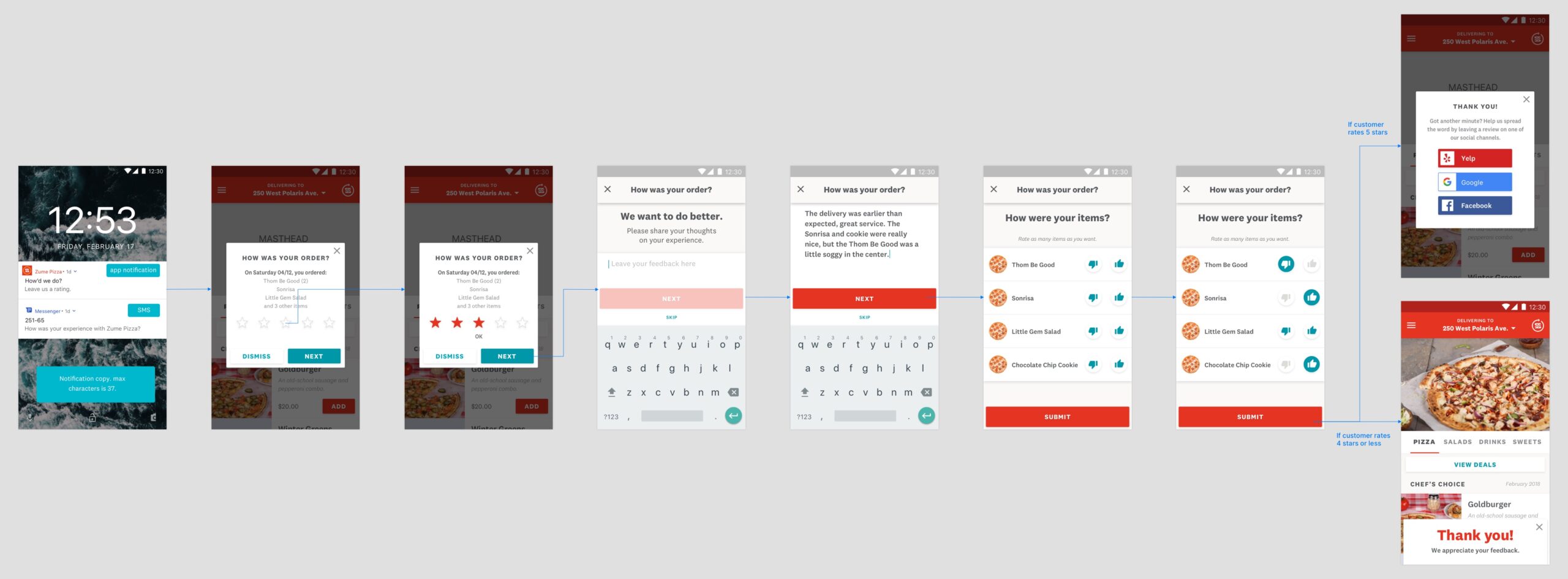
Final designs for desktop and Android (click to zoom).
Register & sign-in redesign
Register & sign-in redesign
Register & sign-in redesign
A redesign was needed to handle a switch in customer credentials
A redesign was needed to handle a switch in customer credentials
Zume Pizza’s marketing team wanted to switch to a registration format that used email & password (they originally used phone number & password). This would align Zume Pizza with similar services, and give marketing the opportunity to follow up with email deals for a future order and marketing content.
The opportunity for improved UX
I knew our current flows didn't have great support for users encountering trouble trying to sign-in or register, and these issues would only become more pronounced as we switched our customer's credentials. I researched and explained UX best practices to engineers and PMs. The result was expansion of the project goals to include helpers and additional support in the recovery flows.
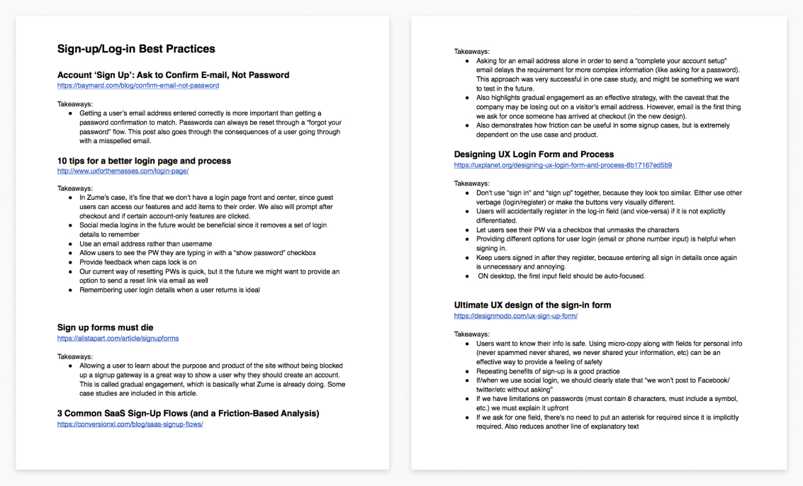
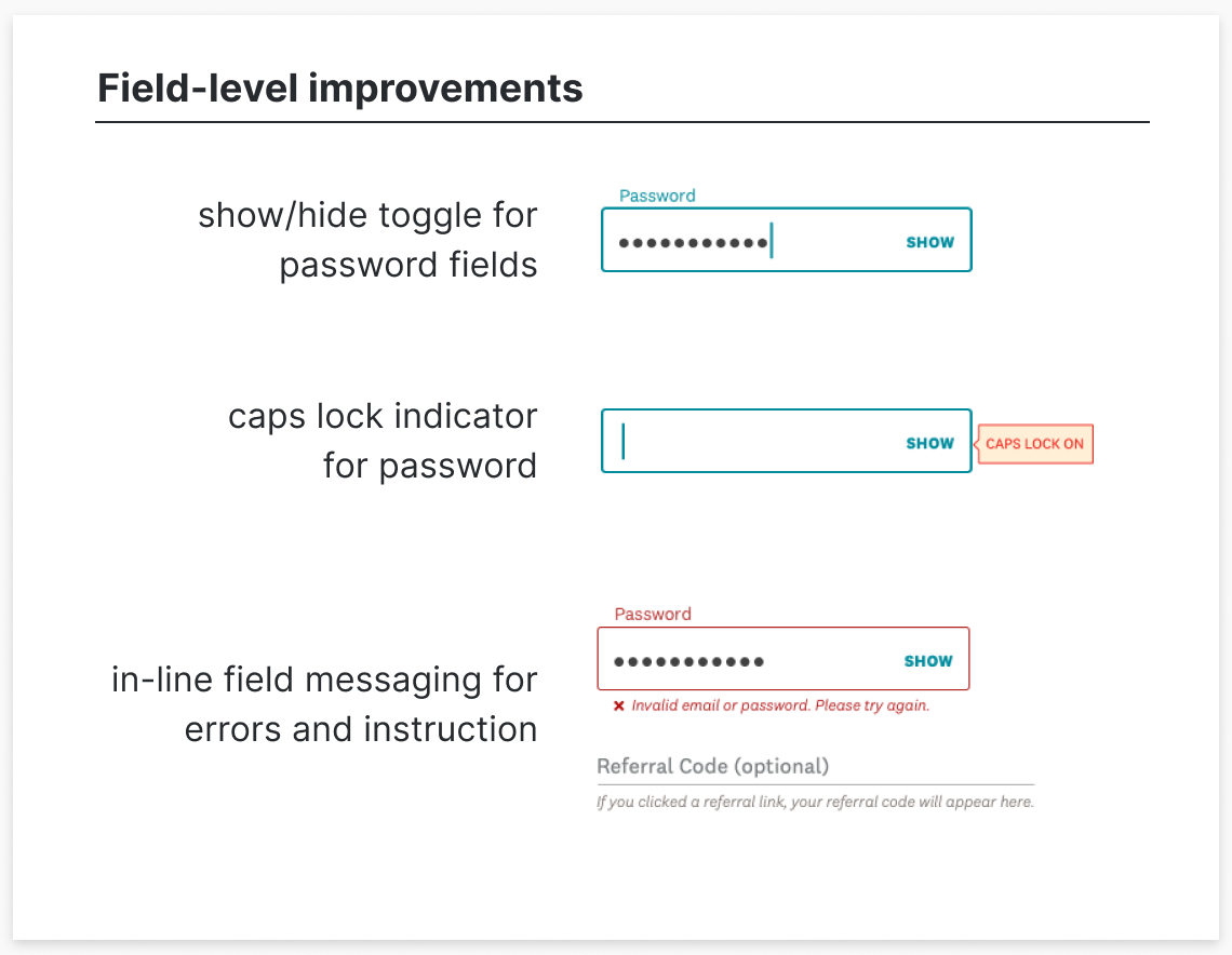
Documentation I created on best practices and field-level UX improvements that were made to the register/sign-in flows.
Moving from phone number to email presented additional recovery scenarios to solve for current customers
Since Zume Pizza’s existing customers were using phone numbers to sign-in, a few recovery scenarios presented themselves. For example, it was possible for a customer’s phone number to be associated with multiple emails, which could further complicate their ability to sign-in properly.
I looked to other services that used email and phone number as dual-authentication, like Gmail and PayPal, to understand how they handled recovery and design for these types of situations.
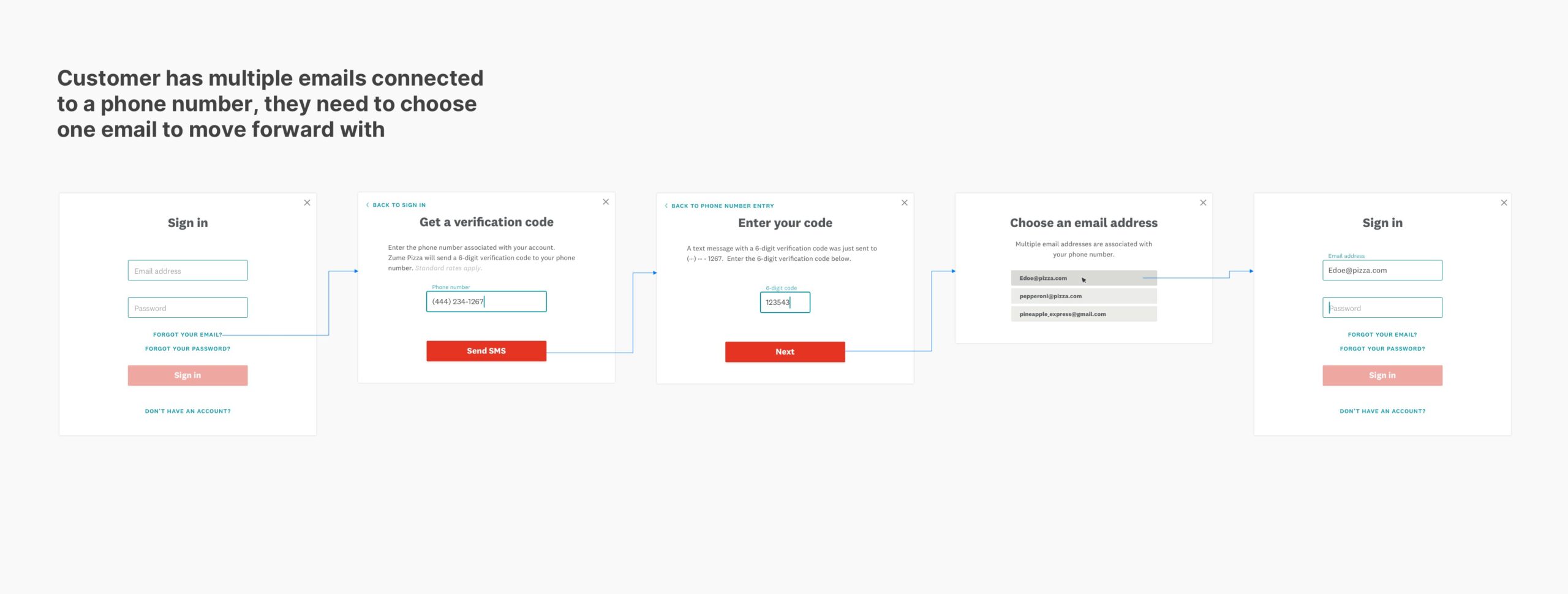
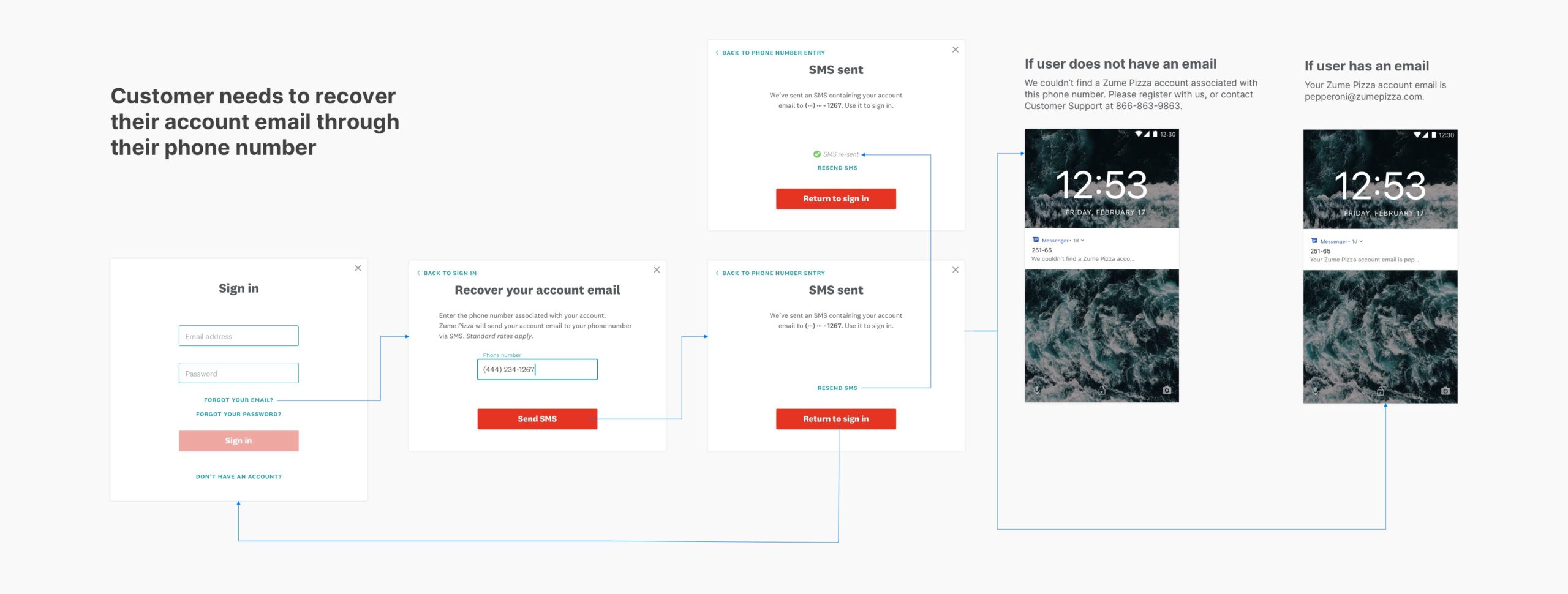
Examples of recovery cases I addressed because of the move from one set of customers credentials to another.
Application to Zume’s customer toolset
After this project, I applied the findings from my initial research to guide future sign-in and registration processes for Zume Inc.’s customer toolset. The result was a quick turnaround (an hour) of a flow map for another instance of sign-in/registration that our design and product teams felt confident in.
The flowmap I created that summarized the best practices, requirements, and steps that our future register/sign-in flows should reference as a starting point.
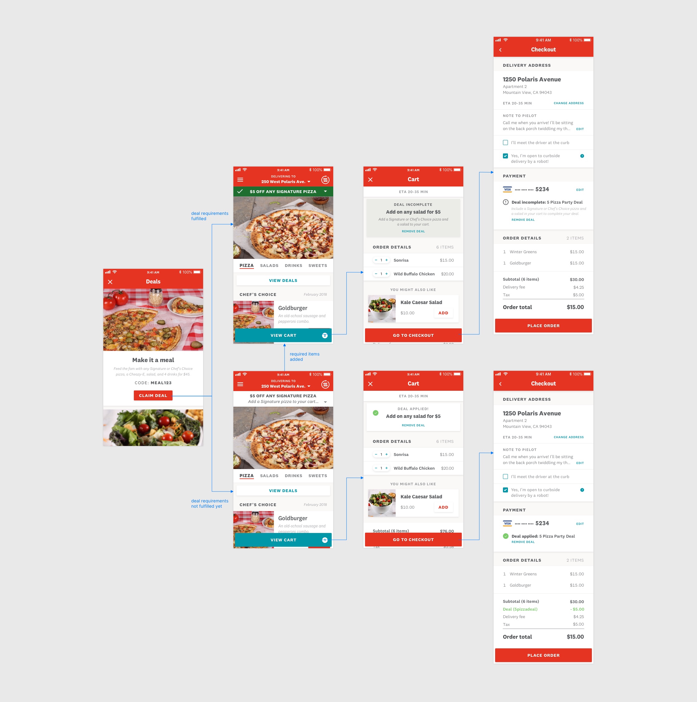
Deals UX refresh
Deals UX refresh
Deals UX refresh
A push for increased deals use
Zume Pizza’s marketing team noticed that deals were performing poorly, and wanted to increase the number of promotions being applied to orders. They felt that the deals should be made more visible on the site to improve this.
Insight: the deals weren’t appealing
We had some basic Hotjar tracking in place on deals funnels which revealed an important insight: customers were seeing the deals page, but not applying them to orders. At the time, Zume Pizza offered 1 or 2 deals options which were highly restrictive to exact types of items and quantities. The more likely conclusion was that the deals lacked appeal, so customers were passing on them.
Revising our strategy
Instead of making the deals more visible to customers, we agreed with marketing to fix straightforward UX issues that had rolled over to the new site from the old, and the marketing team would place improved tracking to see what types of deals were performing best. I worked on additional instructional elements relating to the cart and overall hierarchy of a deal on the page once a customer had applied it.
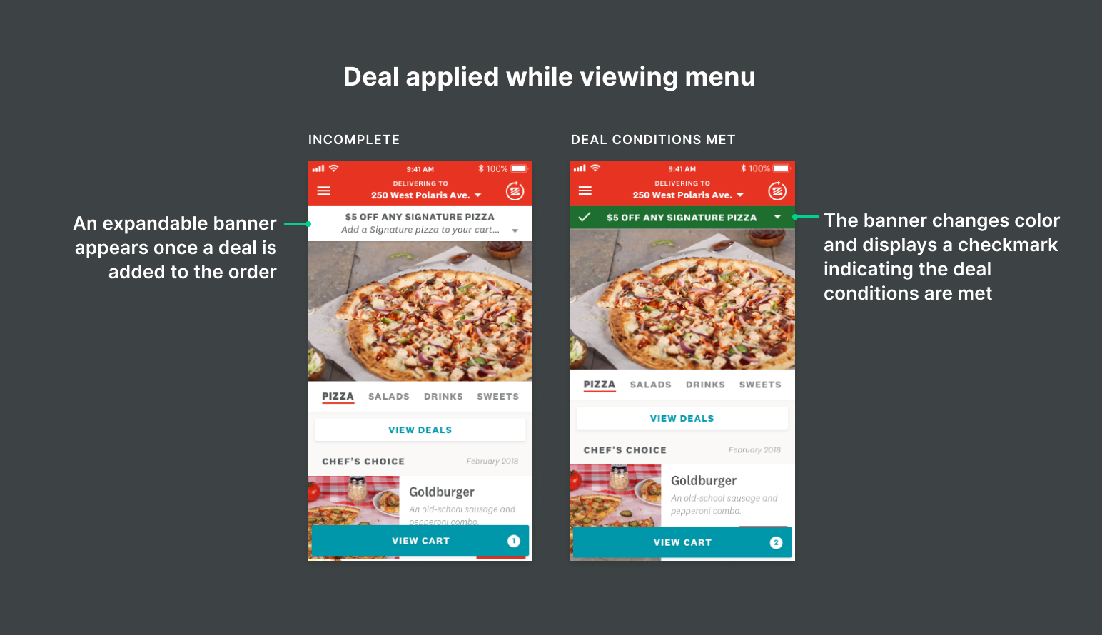
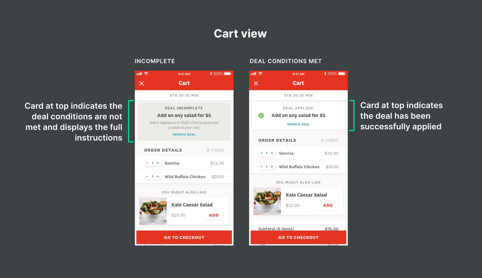
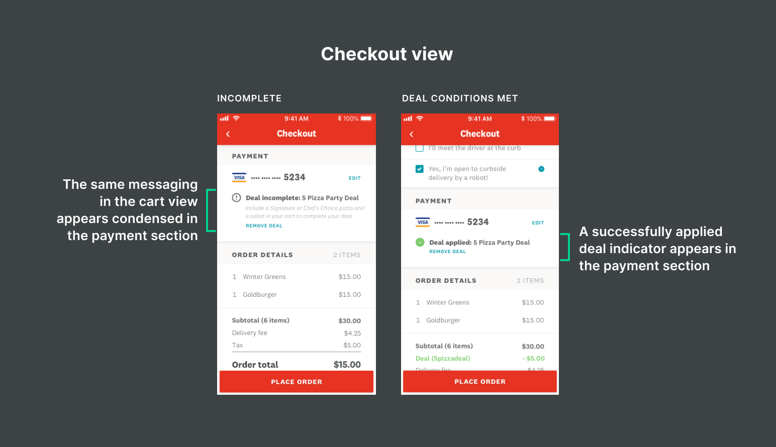
Breakdown of adjustments I made to the mobile app deal flow to improve the UX.
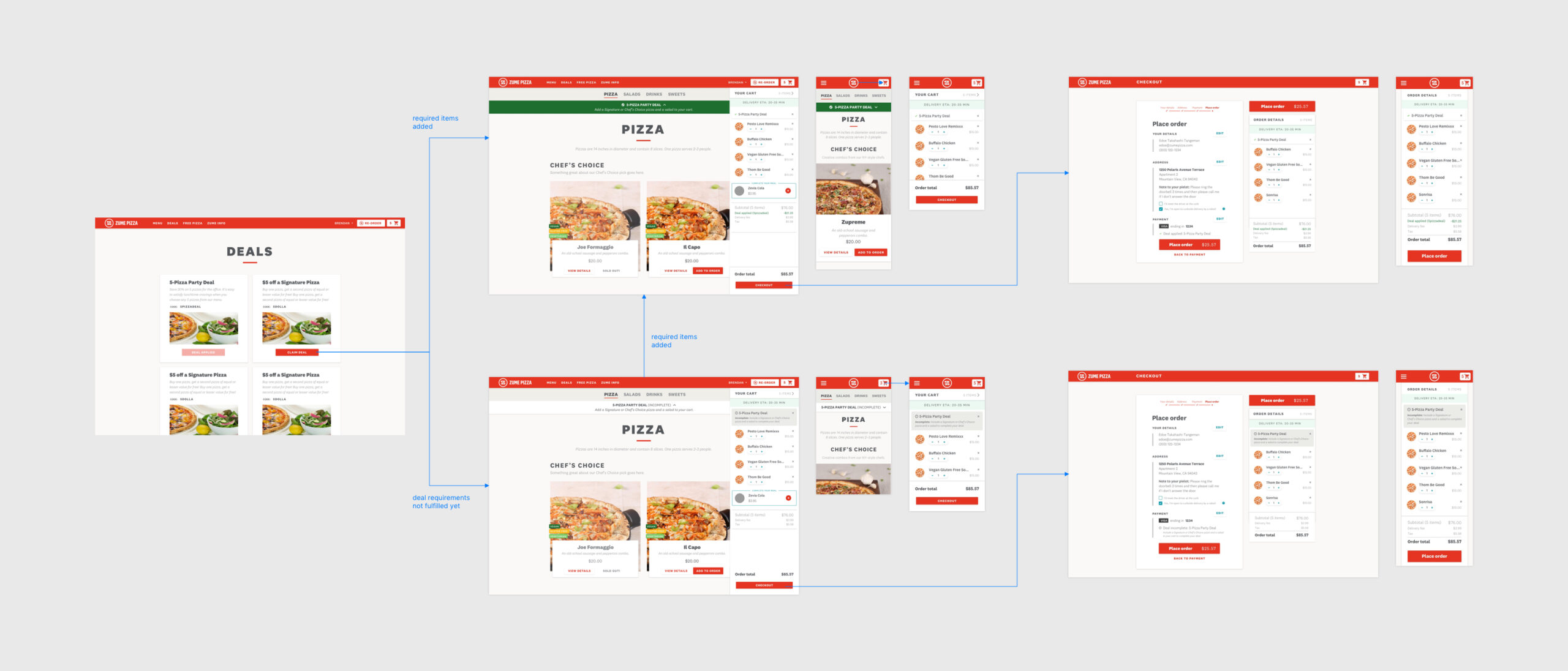
Final flows for web and app experiences (click to zoom).