DIGITIAL REDESIGN: ZUME PIZZA
A refresh and rebranding in time for service expansion
A refresh and rebranding in time for service expansion
A refresh and rebranding in time for service expansion
A refresh and rebranding in time for service expansion
A refresh and rebranding in time for service expansion
Zume Pizza was founded on the principle of making affordable fast food that was better for its customers’ health, its employees, and our planet. The company had put some effort into branding, but it hadn’t been a top priority in the first couple of years.
With plans to expand rapidly outside of its single Mountain View service area, Zume Pizza needed a brand image that spoke to its principles and rebranded platforms that provided a consistent look & feel, inspired trust in food quality, and that were quick and easy for customers to order from.
BEFORE AND AFTER
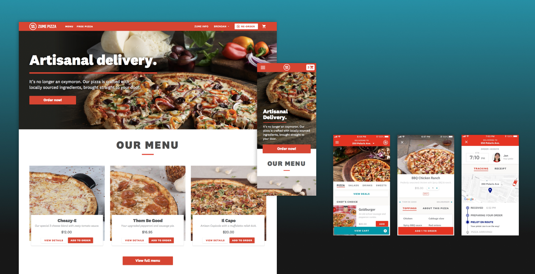
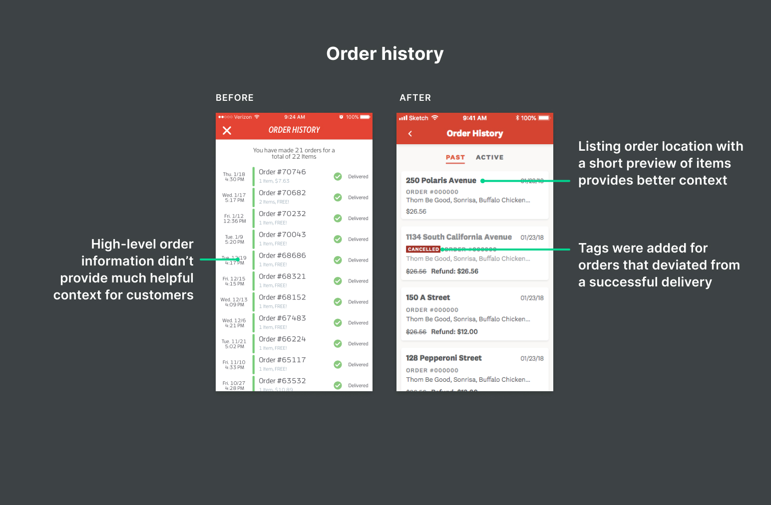
The site had to explain Zume Pizza’s story to people and make ordering simple
Zume Pizza’s website had a broader amount of information to cover than the apps, including new educational content from our writers for newcomers on why Zume Pizza was worth trying, how their pizza is made, and how it’s delivered.
The site was also where most people made their first order. Ordering needed to be easy both as a guest and with an account allowing access to features like quick re-ordering, redeeming free pizza credits, and saved delivery / payment details.
A lot of the work ahead of us was around consolidating many styles of components and text, which made the site feel cluttered and inconsistent. We designated levels of button hierarchy and typography for specific uses, and went through iterations of the visual design as the brand design progressed.
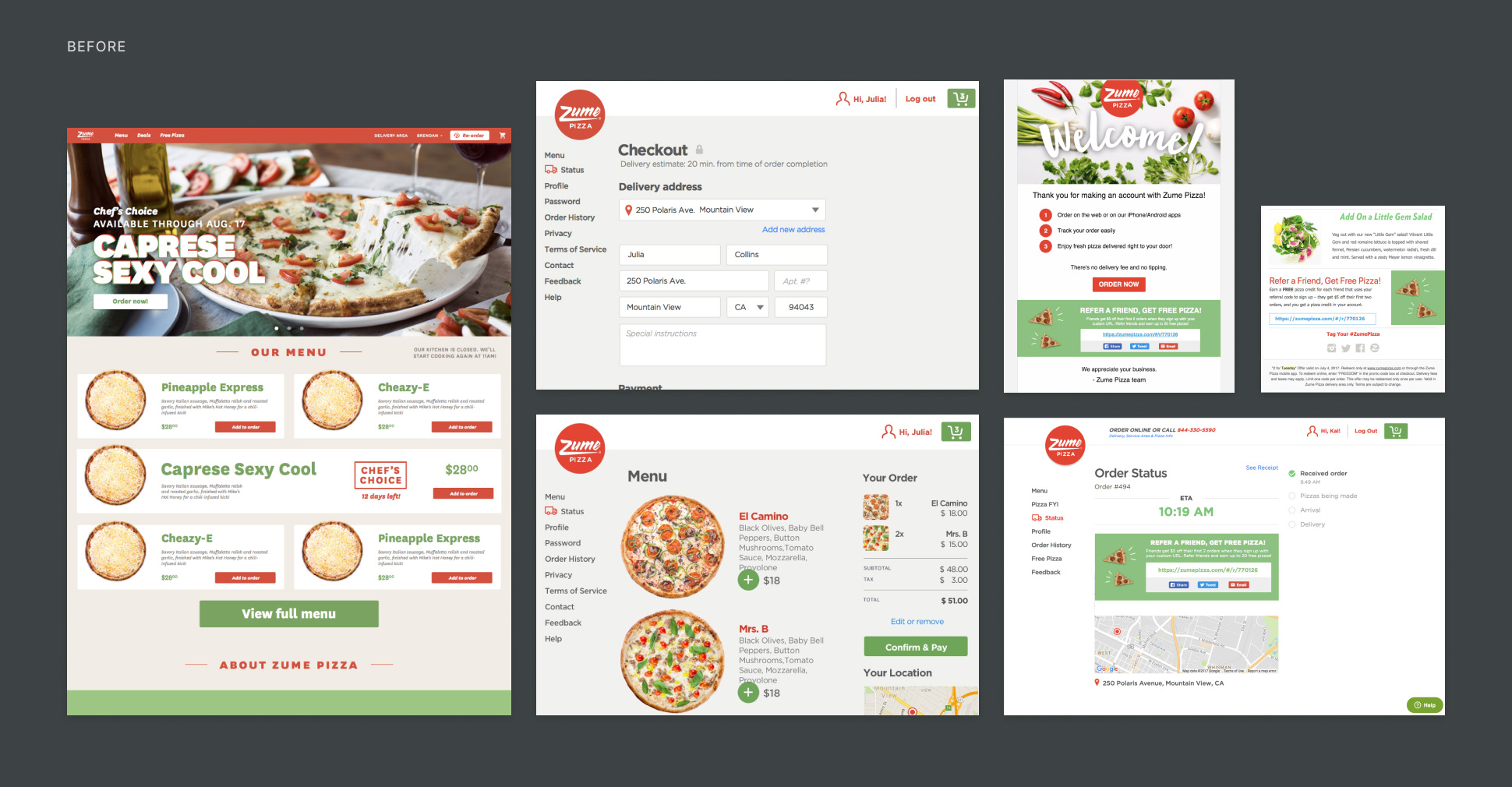
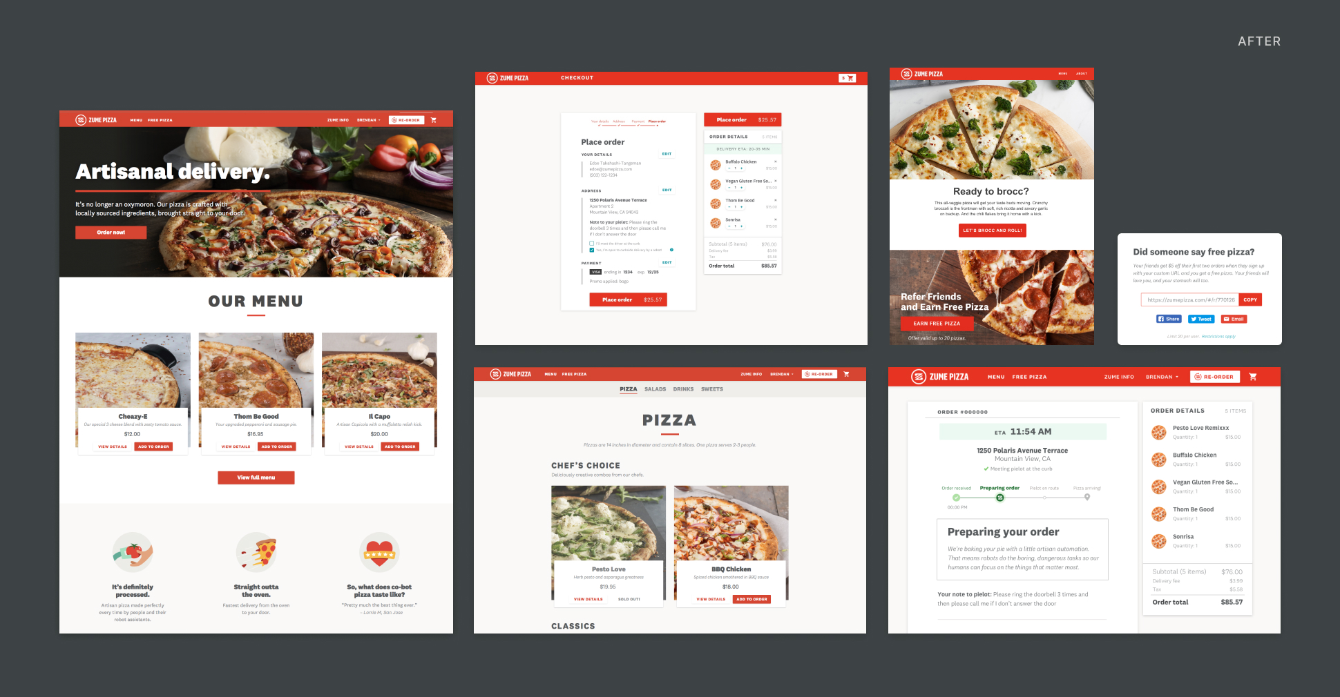
THE SITE, BEFORE AND AFTER
Move the vertical slider to view the designs before we started, and the result afterwards.
The apps focused on streamlined ordering and repeat customers
Zume Pizza’s apps were focused on repeat customers. This meant much of the informational content on the website was cut out, with the focus being on a quick and easy way to order pizza. It also meant that customers needed to make an account before ordering so that their details could be stored for future orders, much like other food delivery apps.
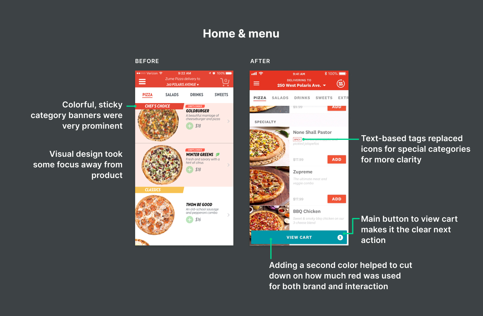
THE APPS, BEFORE AND AFTER
A comparison before and after of some design details from Zume Pizza's mobile app. The iOS version is shown here.
OUR CHALLENGE
Refresh the digital platforms during a brand redesign in 6 months
The driving force behind the timeline was a brand relaunch that would be announced on Pi(e) Day (3/14), and provide momentum to the following service area launches. The site and apps ended up going live approximately 1 week after the original deadline. Some general challenges that Zume Pizza was coming up against that we thought about as we were designing:
- Zume Pizza was an unfamiliar contender in a saturated market. Most people already have a pizza place they like to order from—convincing them to try something new when they already have a reliable favorite can be difficult, especially since Zume Pizza had no brick and mortar location to visit.
- Perceptions of automation and quality. Convincing customers that pizza made in part by robots would still be delicious and made with care was a hurdle.
- A lot of novelty at once. Robots, predictive analytics, food trucks, and delivery-only pizza was a lot of complexity for prospective customers to process. This wasn’t helped by articles that were explaining Zume Pizza’s processes through their own filter, since Zume Pizza wasn’t owning customer education yet.
EXAMPLES OF THE EXISTING BRAND
Visually, Zume Pizza looked fairly similar to other pizza or catering companies at the beginning of the project. These treatments didn't necessarily convey the message of reliably hot and fast pizza using new food technology.
My role
The team included my product designer teammate, a product manager, our director of design, 3 brand designers, 2 writers, and photographers who re-shot Zume Pizza’s menu and created hero images for use throughout digital and printed materials. I worked with multiple engineering pods to get the designs live. The work of the site and apps was split between me and my product designer teammate. Highlights that I worked on include:
Website
- Sign in & register
- Menu & product details
- Cart
- Account and orders views
- Modals, error message handling
- Zume Pizza careers listing
Apps (iOS & Android)
- Sign in & register
- Product details
- Order tracking
- Account and orders
- Retroactive design system
Brand
- Contributed to logo sketches for Zume Pizza and Zume
- Created color and type studies
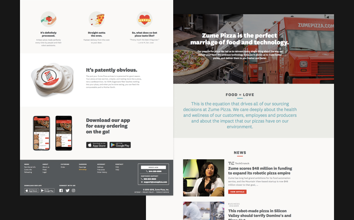
WEBSITE
Planning & research
We started by planning timelines of specific pages and flows with our PM, and assigning those pieces to either my teammate or me. Most of the design materials from the previous site that we had access to were incomplete design files and past, partial mappings left from the previous design team at Zume Pizza. Since any changes to the current flows would impact engineering’s work, we needed to spend more time mapping out the existing flows to make sure we were designing in parallel to them.
Since we were working backward to define our timelines from a pre-defined deadline, most of the sections were done in 2 weeks or less.To make informed decisions that we knew were backed by research, my teammate and I relied on information around best practices for e-commerce from reliable sources like the Baymard Institute and the Nielson Norman Group.
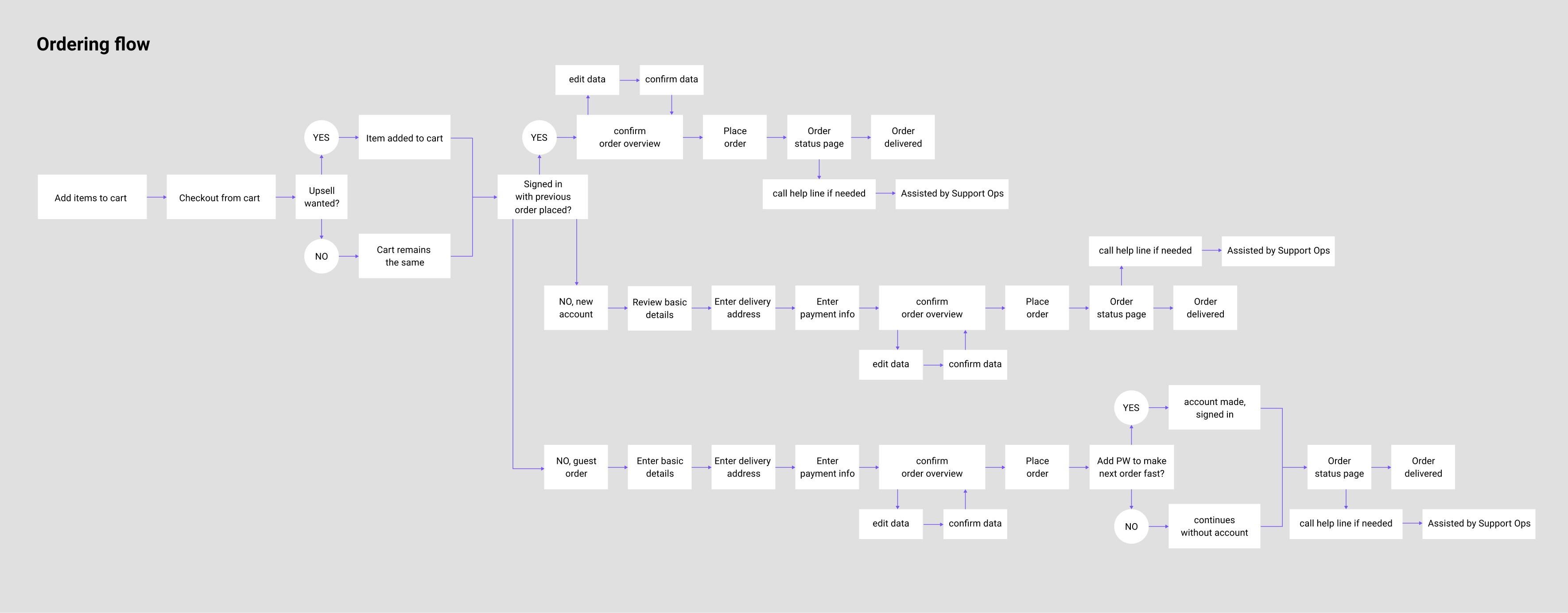
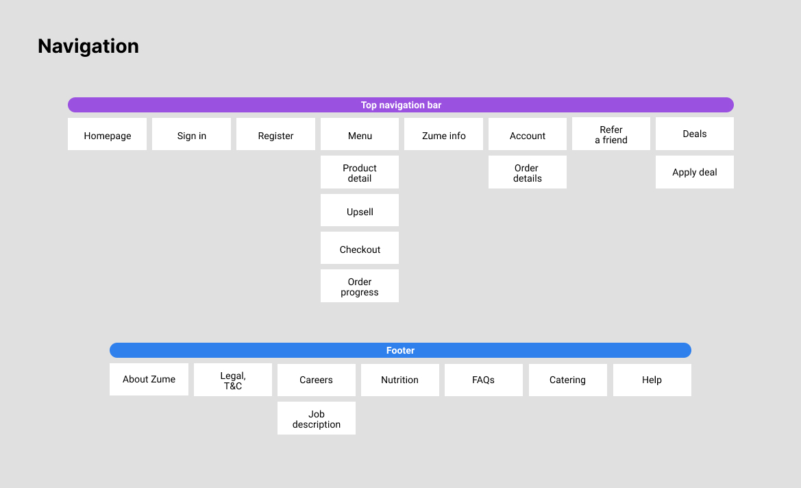
MAPPING FLOWS AND NAVIGATION
Examples of our organizational documents that we created to use as a guide as we designed the new site (click to zoom).
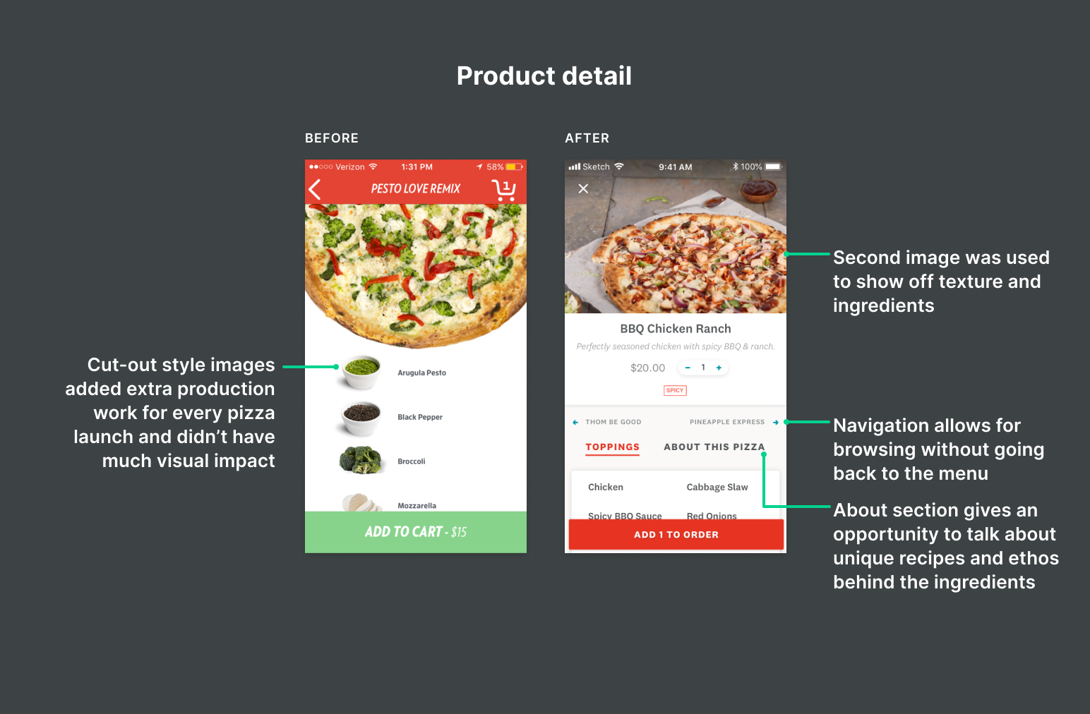
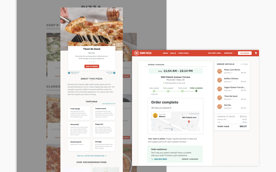
Redesigning the menu and product description pages
Some of the first items I started working on were the menu and product detail view. A lot of the visual explorations I went through were around these ideas that we felt were integral to Zume Pizza’s principles that the team had talked through with Juila Collins, one of Zume Pizza’s founders:
- A sense of pride in the products and their ingredients
- Quality, honest food
- Hospitality and warmth
I worked with our Director of Design and the design team to come up with a final menu card concept that revealed ingredients on hover. Zume Pizza prided themselves on their unique recipes, so it was important for each pie's thoughtful description to be visible in addition to the often unconventional ingredients. This hover allowed the imagery to shine while keeping all the nessessary information close by as customers made ordering decisions.

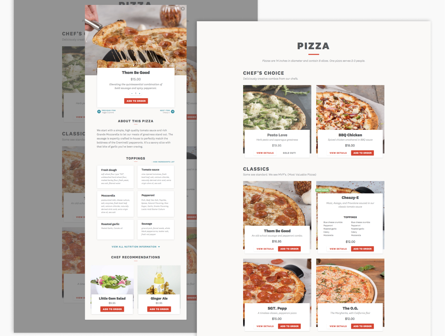
FINAL MENU AND PDP DESIGNS
The final item card hover interaction, and final designs for the menu and product description pages.
Making modals and forms consistent throughout the site
I re-organized information while aiming to keep a sense of consistency throughout the smaller typographic details of the site, which were originally largely unstructured and difficult to parse through. I worked with engineering to get the different types of modals implemented, and mapped out when to use a certain type of modal for future engineering needs (e.g. new error messages, yes/no input from customers).
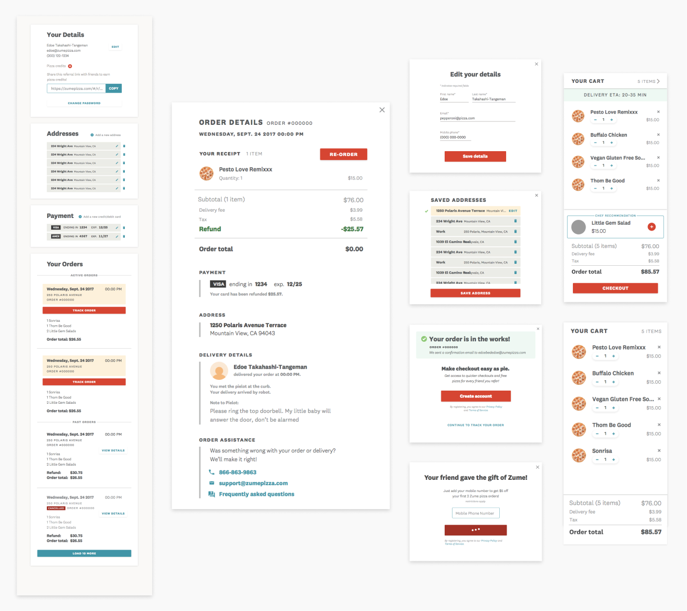
REDESIGNED MODALS AND FORMS
Examples of modals and forms I re-worked to be more modular and consistent accross the site.
APPS
Using our time wisely as we came down to the wire
The apps were left until the end of our timeline, and in total the two of us ended up having about 2.5 weeks to fully re-skin and refresh them. Although our timeline was short, we were able to start with a good sense of the brand elements from the rebranding and website, which were now just about complete.
Before starting design, we conducted a speedy competitive audit by using a bunch of delivery apps and pizza company apps to see how they were solving similar problems. Things like dropping you onto a menu as soon as possible and having a sticky checkout button at the bottom of the screen expedited the time it took us to get from empty cart to food on the way.
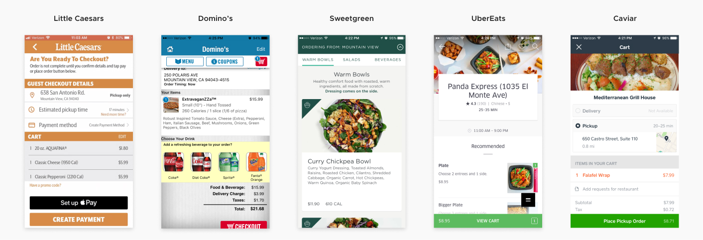
COMPETITIVE AUDIT
Screenshots from some of the services we looked at, including restauraunt chains and delivery services.
Following respective OS conventions
Our main concern between the two platforms was making sure the apps felt like they fit into their respective platform. Tweaks to elements like header treatments, toggles, and field forms made each of the apps feel more at home.
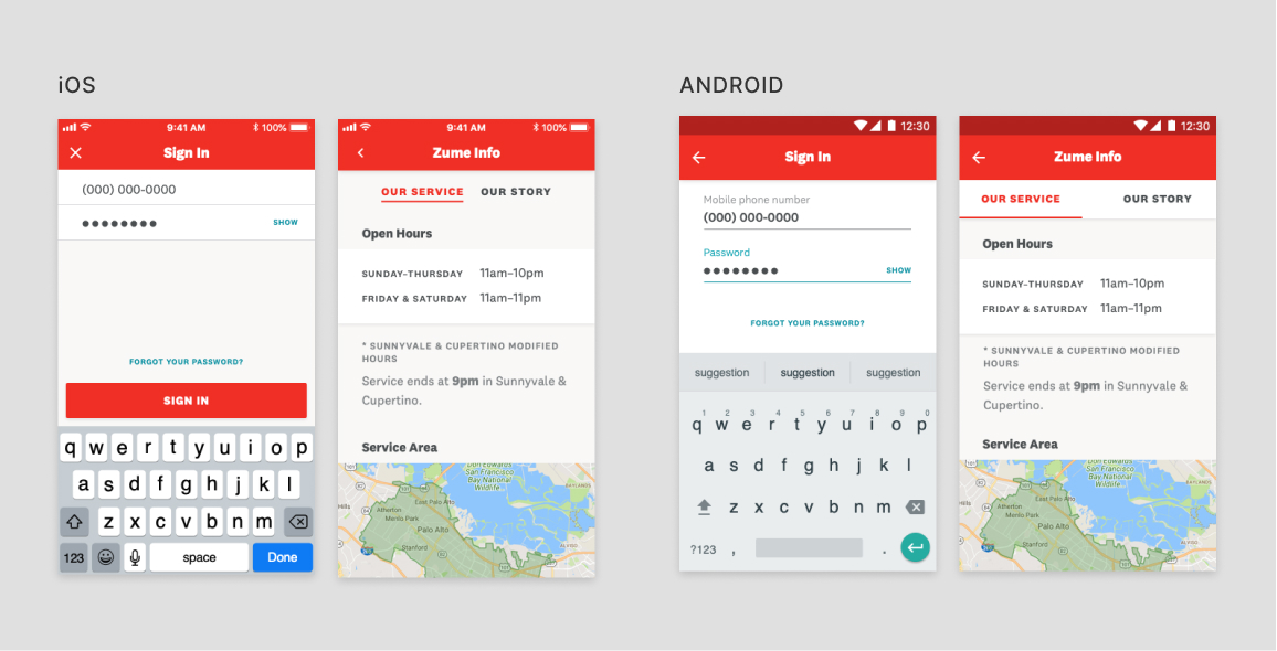
iOS AND ANDROID TREATMENTS
A comparison of our iOS and Android treatments to make them feel more at home on their respective platform.
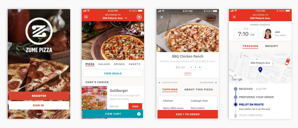
Streamlining the mobile app flows
Just about all of the marketing and educational content that was added on the website was cut out of the apps, besides an About page. Our focus was on making the ordering experience and adjacent views to edit customer information as streamlined as possible.
FINAL FLOWS AND PAGES
Some of the final flows for our apps, ordering and account options.
Making a design system retroactively
A close-to-fully-realized brand design helped us expedite the visual design of the apps. Even so, we were still designing at breakneck speed to cover everything and did not have time to build out a design system. We used Sketch symbols to keep things consistent between the two of us. After the apps were launched and we switched from Sketch to Figma, I created a design system that would allow us to make global changes to colors and type styles with responsive components.
Of course, a design system would be useful for new features Zume Pizza introduced. Later, Zume Pizza expanded to the food operations company Zume, and planned to offer a similar type of ordering app to their restaurant customers. With a base design system in place, we could efficiently swap another restaurant’s branding into the existing app structure.
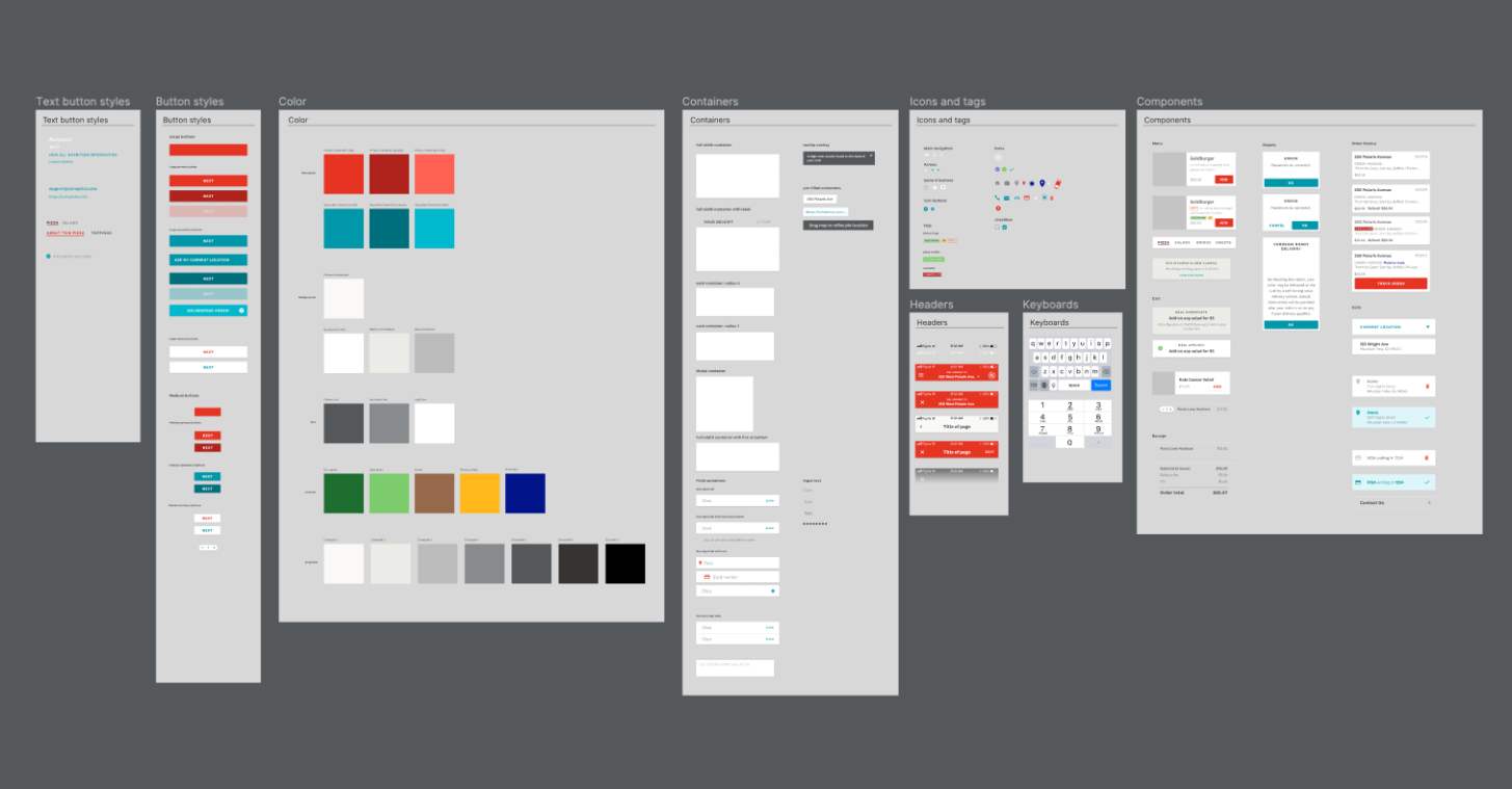
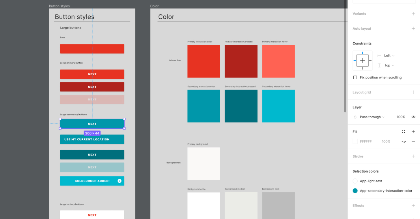
APP DESIGN SYSTEM
The final app design system in Figma I built after the launch.
BRINGING IT ALL TOGETHER
Working with our brand designers for a cohesive look and feel
During the project we were consistently checking in with the brand design team to align the designs we had in mind with the brand’s visual identity. Our teams were small, which was a big advantage in this aspect. We often could review product and brand work all in the same weekly design review meeting. We kept our wireframes at a mid-level of visual design fidelity so that we could refresh it towards the end of the timeline with the final brand choices.
Branding and marketing
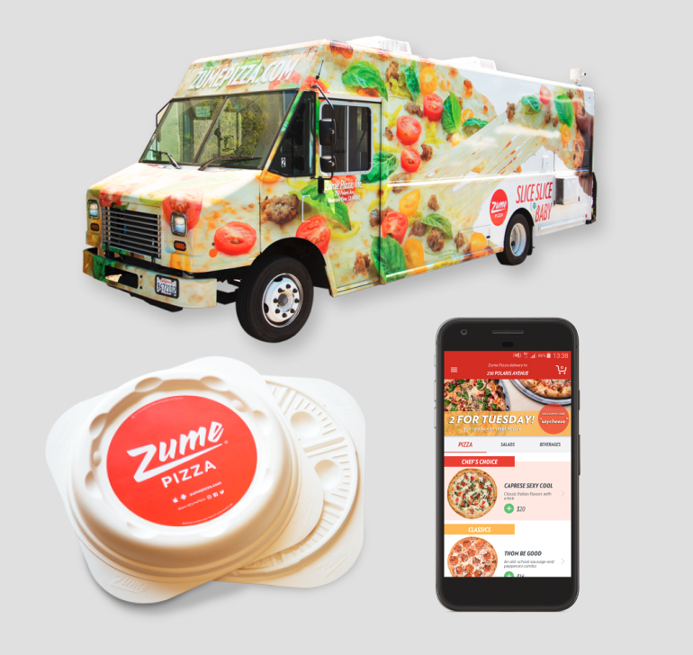
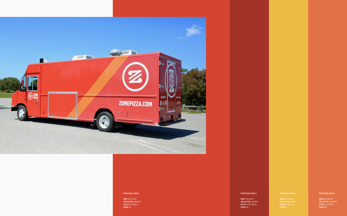
The final brand design by our branding team put an emphasis on speed with diagonal elements in the logo and graphic elements, like the trucks. Red was the primary brand color alongside other shades of yellow and orange, which was chosen to align with the idea of hot and fresh pizza.
The digital touchpoints
Both the website and app ended up with fairly far-reaching redesigns. In addition to the visual redesign, we made UX and interactive improvements to each section as we went along based on best practices for e-commerce. We knew these changes would be a big step up from many of the fairly bare-boned flows of the original experiences.
CONCLUSION
Outcomes
- A new brand design that Zume Pizza’s founders were excited about and felt represented the company in an authentic way
- Redesigned digital ordering platforms for web and mobile that included signifigant UX and visual improvements to the ordering experience based on research from the Baymard Institute and the Nielsen Norman Group
What I learned
Set expectations early and often with planning activity. In the early stages of this project with such a small team, the approach was fairly freeform. We quickly found that the original expectation from higher-level stakeholders of seeing fine-detail improvements to serve the brand redesign would change without rails in place. A section refresh would bloat into new features that the site didn’t have, often being brought up at a late-stage design review. This would prompt the expectation of additional exploratory design work and reviews at what was supposed to be the end of a design cycle, borrowing time that we didn't have. This was a great lesson in why broader planning is so important to the success of a project, and in figuring out what specific types of planning activity worked for us.
What I would add
What I would add
More details across the digital touchpoints to justify the decision of trying out the product. Zume Pizza was under pressure to show that they could make money. At the end of the day, it needed to justify why people should try Zume Pizza’s service and product instead of ordering from a place they already know. Zume Pizza definitely had the story to sell this: as a small example, they worked with local farms to find quality ingredients with less environmental impact. Snippets like this could have been added into the menu or product pages for customers as they browsed. Unfortunately, this type of content just wasn’t queued up for people to see how Zume Pizza was making great culinary decisions alongside unconventional food technology. Additionally, evidence like this may have helped justify prices that were consistently higher than their competitors, and only kept climbing after the rebranding.